Content
- What Is Typography, and Why It's More Than Choosing a Font
- Why Typography Is Gaining Importance in Digital Marketing Right Now
- How Typography Impacts User Experience and Conversions
- Core Elements of Effective Marketing Typography
- Typography Across Digital Marketing Channels
- Common Typography Mistakes That Undermine Marketing Performance
- Emerging Typography Trends Shaping Digital Marketing
- A Practical Checklist for Auditing Your Brand's Typography
- Conclusion
- Frequently Asked Questions
Why Typography Is Becoming Important in Digital Marketing
Attention online is short, and text is still how most brands communicate their message. Yet many marketers still treat typography as a minor design detail rather than a strategic tool. That is changing.
As mobile browsing dominates, AI-generated content floods every feed, and users scan more than they read, the way words look on a screen is starting to influence trust, comprehension, and conversions.
This article breaks down why typography is becoming important in digital marketing and what marketers should do about it.
What Is Typography, and Why It's More Than Choosing a Font
Typography is the practice of arranging text to make it readable, functional, and visually clear. It includes font choice, but also size, spacing, weight, alignment, and contrast working together as a system.
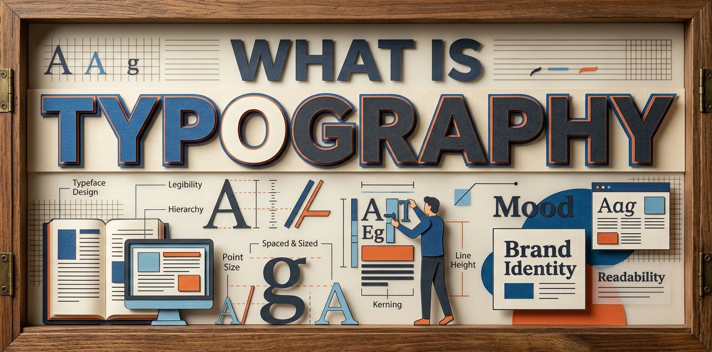
A typeface is just the design of the letters.
Typography is how that typeface is used: the line height between sentences, the width of a paragraph, the size difference between a heading and body text. Marketers often focus on messaging and ignore this layer entirely, even though it shapes whether the message gets read at all.
Why Typography Is Gaining Importance in Digital Marketing Right Now
The Shift to Mobile-First Reading
Most web traffic now happens on phones, not desktops, which means the first and most important reading experience for many brands is on a smaller screen. Small screens leave far less room for error. Text that looks fine on a laptop can become cramped, tiny, or hard to scan on mobile, and that friction shows up directly in bounce rates.
Helping with Creative Video Content Generation
Typography now plays a role in video creation too, not just static content. Marketers increasingly use image to video AI tools, turning still visuals into motion using text prompts and on-screen typography to guide the output.
Clear, well-styled text keeps these AI-generated videos on brand and easy to follow, especially for viewers scrolling with the sound off. As image to video tools speed up content production, typography remains one of the few elements marketers can control to keep the message clear.
Shrinking Attention and Scanning Behavior
People rarely read web content word by word. Reading follows a natural scan path where the eyes move in short bursts across a few letters at a time before pausing to process what they just read. Well-organized, clearly typeset content fits this pattern.
Dense, poorly structured text fights against it, and readers give up faster than marketers expect.
Supporting Lifestyle and Product Video Content
Typography also plays a role once a shopper reaches the product page itself. Tools like Placeit generate lifestyle scenes that help buyers picture an item in real use, such as in their own kitchen or gym bag.
Clear, well-placed on-screen text in these clips reinforces the product name or key benefit without competing with the visual, helping the video answer usage questions that copy alone cannot.
AI-Generated Content Has Raised the Bar
With so much content now produced quickly using AI tools, generic writing is everywhere. Thoughtful typography has become one of the few remaining signals that a real brand, not a template, shaped the page.
Clean hierarchy, deliberate spacing, and a considered type system tell a reader this content was built with care, which supports trust before a single word is even absorbed.
Typography as a Trust and Brand Signal
A typeface can create emotion, enhance a theme, spark interest, add personality, and even convey trust, all of which matters to how a brand is perceived.
A financial brand using a heavy, playful font sends the wrong signal before the copy is read. Typography is doing brand work whether marketers plan for it or not.
How Typography Impacts User Experience and Conversions
This is where typography stops being subjective. Lines between 50 and 75 characters with a line height around 1.5 times the font size improve comprehension and lower bounce rates, and 16px body text is notably more engaging on mobile than smaller sizes like 14px.
Real examples back this up. One documented case saw a typography fix improve bounce rate by 10 percent and form conversions by 133 percent, while A/B tests on font choices have driven conversion increases of up to 15 percent for some clients.
Not every debate is settled by data, though. A Google and IBM study found serif font Georgia only marginally faster to read than sans serif Helvetica, with no real impact on comprehension. Font size, spacing, and contrast matter more than typeface style alone.
Core Elements of Effective Marketing Typography
Visual Hierarchy
Hierarchy uses size, weight, and spacing to tell readers what matters most. Headlines should be visibly larger and bolder than subheadings, which should be visibly different from body text. If everything looks the same size, nothing stands out.
Readability Fundamentals
Comfortable reading depends on a few measurable factors:
Keep body text around 16px minimum, especially on mobile
Use line lengths between roughly 45 and 75 characters
Set line height at about 1.5 times the font size
Avoid long unbroken paragraphs
Contrast and Accessibility
Text needs enough contrast against its background to be legible in different lighting conditions and for users with visual impairments. Gray text on a white background may look modern in a mockup, but it often fails in practice. Accessible typography is not optional. It affects how many people can actually use your content, not just how it looks.
Consistency Across Touchpoints
Brands that stick to two or three fonts and apply them the same way everywhere build recognition faster than brands that vary type treatment page by page. Consistency signals a considered brand, not a rushed one.
Typography Across Digital Marketing Channels
Typography needs to shift depending on where content is consumed. What works on a website won't necessarily hold up in an email inbox, a social feed, or a video ad, so it helps to think about each channel's specific demands separately.
Website: Use responsive sizing, strong contrast, and consistent hierarchy across every page.
Email marketing: Font rendering varies by client, so stick to safe, web-friendly fonts.
Social media: Use bold, legible type that still works at small sizes and in thumbnail previews.
Video and ads: Keep text large enough to read quickly, place it over solid backgrounds, and make sure it never competes with the visual.
Common Typography Mistakes That Undermine Marketing Performance
Small typographic errors quietly damage performance more often than marketers realize.
Too many fonts: Mixing several typefaces creates visual noise and weakens brand consistency
Low contrast text: Trendy muted colors often fail basic legibility, especially outdoors or on older screens
Tiny mobile font sizes: Text that looks fine on desktop can become unreadable on a phone
Flat hierarchy: When headings and body text look too similar, readers cannot scan effectively
Ignoring accessibility: Skipping contrast and sizing standards excludes real users, not just an edge case
Emerging Typography Trends Shaping Digital Marketing
Typography continues to evolve alongside design technology. Variable fonts are transforming performance and flexibility in web design, allowing type to adapt more efficiently across devices.
At the same time, bold typography in branding is gaining traction because it offers a timeless quality that helps brands avoid fleeting trends, which matters as more generic, templated content competes for attention.
Many brands are also moving toward defined typography systems, with fixed sizes, weights, and spacing rules, rather than making font decisions page by page.
A Practical Checklist for Auditing Your Brand's Typography
Review your top performing pages for font size, contrast, and line spacing
Test how your typography actually renders on real mobile devices
Limit brand typography to two or three fonts maximum
Check contrast against accessibility standards, not just visual preference
Confirm hierarchy is clear at a glance, without reading the copy
Conclusion
Typography has moved from a design afterthought to a measurable performance factor in digital marketing. It shapes readability, trust, and conversions, often before a reader processes a single word.
Brands that treat typography as a deliberate system rather than a default setting will consistently outperform those that do not. The highest-impact next step is auditing your current pages against the basics: size, spacing, contrast, and consistency.
Frequently Asked Questions
What is the best font size for digital marketing content?
A minimum of 16px for body text is generally recommended, especially for mobile readers. Smaller sizes tend to increase strain and bounce rates.
Does font choice really affect conversion rates?
Font choice alone has limited proven impact, but spacing, size, and contrast do affect readability and conversions. Typography as a whole system matters more than the specific typeface.
How many fonts should a brand use?
Most brands should limit themselves to two or three complementary fonts. Using more than that tends to create visual clutter and weakens consistency.
Is serif or sans serif better for online reading?
Research has found no significant readability difference between well-designed serif and sans serif fonts. Spacing, size, and contrast matter far more than the style chosen.
Why does typography matter more now than it used to?
Mobile reading, shorter attention spans, and a flood of AI-generated content have made clear, well-structured typography a stronger trust and usability signal than before. It now directly affects whether content gets read at all.

Admin
Admin is a professional and creative specializing in the latest stylish font styles for social media and brand promotion. With a passion for modern typography and digital trends, Admin helps users create eye-catching text that stands out online.