Content
- Pick a Display Font and a Workhorse Font
- Carry the Fonts Onto Branded Merch and Packing Inserts
- Choose the Display Font for the Buyer, Not the Mood Board
- Test the Workhorse Font on a Phone Before Launch
- Put the Same Fonts on Labels, Tags, and Listing Images
- Make Social Posts Recognizable Before Anyone Reads the Handle
- Where to Start This Week
How Ecommerce Stores Can Build a Brand Identity With Fonts
Ecommerce stores can build a stronger brand identity by choosing a consistent font system and using it across their website, packaging, product listings, and social media.
Start with one display font for headlines and branding, then pair it with a readable workhorse font for product details and other everyday text.
Using the same two fonts across different customer touchpoints makes the store easier to recognize. Testing those fonts on phones, labels, tags, and promotional materials also helps keep the brand consistent wherever customers encounter it.
Pick a Display Font and a Workhorse Font
The display font is used for the store name, homepage headlines, and campaign graphics. The workhorse handles everything a customer reads before buying: product descriptions, prices, size charts, shipping policies, and order emails.
That second font has the harder job. It has to stay legible at small sizes and come in at least 3 weights, so you can set a bold price, a regular description, and a light caption without reaching for another family. A geometric sans like Poppins covers this for most stores and sits comfortably beside almost any display face.
The usual mistake comes later, when someone adds a third font for the sale banner and a fourth for the blog. If a new element seems to need a new font, it almost always needs a different weight or size of the workhorse instead.
Carry the Fonts Onto Branded Merch and Packing Inserts
Once the type rules hold on screen, merch is the next place to test them, and custom embroidery designs are the toughest test of all. Print-on-demand platforms like Printify let a store put its display font on caps, hoodies, polos, and tote bags without buying stock up front.
The seller uploads the design and lists the product, and a print partner stitches and ships each piece only after a customer places an order.
Thread is less forgiving than ink. Hairline strokes and tight script loops fill in when stitched, so the embroidered logo may need a heavier weight from the same family, and a sample order before listing will show you exactly where it struggles.

Packing inserts cost almost nothing by comparison. A thank-you card with the display font on the headline and the workhorse on the discount code keeps the unboxing consistent with the store, and a small branded freebie in the box works harder still. In PPAI Research's 2025 survey of 1,000 US consumers who had received promotional products, 61% said they clearly remember the brand behind the last one they got.
Choose the Display Font for the Buyer, Not the Mood Board
A store selling $38 soy candles can't headline in a bubbly rounded face and expect buyers to accept the price. The display font sets a price expectation before the product photo finishes loading. 2024 survey of 4,777 design industry members across more than 13 countries found 83% ranked
Design professionals treat that call seriously: Monotype's font selection among the top 3 components of their creative decisions.
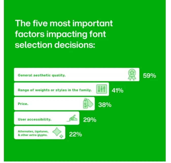
Start with who buys and what they pay. Skincare and jewelry usually suit a high-contrast serif or a restrained script; outdoor gear suits a heavy squared sans; and kids' products can carry a rounded face without losing trust.
Then cut anything that has been overused into a joke. Kristen ITC, Hobo, and other fonts that read as amateur cost a new store credibility faster than a bad product photo does.
Test the Workhorse Font on a Phone Before Launch
Most store owners design on a laptop, while most of their customers buy on a phone. Adobe Analytics data for the 2025 US holiday season showed that 56.4% of online spending occurred on mobile devices, up from the previous season.
Open a product page on your own phone and read the size chart, the shipping line under the price, and the returns policy. Thin weights that looked elegant on a 27-inch monitor turn faint on a small screen, and condensed display faces get cramped once a product name wraps onto 2 lines.
If you have to squint at your own price, customers will scroll past it. When the display font breaks down at small sizes, keep it for large headlines and let the workhorse take over product titles.
Put the Same Fonts on Labels, Tags, and Listing Images
A buyer who finds you on Etsy or Amazon sees your listing images long before your website. Text overlays on those images, such as the product name or a key feature, should use your 2 fonts set the same way every time, so the listing looks like it came from the store behind the ad they saw last week.
Physical labels follow the same rule, and they're the parts customers actually hold. Jar labels, hang tags, care cards, and the sticker sealing the tissue paper are all type-heavy. Script faces on packaging can signal something handmade and premium, but set them large and keep ingredients or care instructions in the workhorse.
Keep a single template file per label type and send it to every printer and freelancer you use. Otherwise, they substitute whatever font is installed on their machine, and nobody catches it until 500 labels arrive.
Make Social Posts Recognizable Before Anyone Reads the Handle
The 2025 Sprout Social Index surveyed 4,044 consumers in the US, UK, Canada, and Australia who follow at least 5 brands, and 81% said social media drives them to make impulse purchases. That buyer often goes from a post to checkout without seeing your homepage, so the post has to carry the brand on its own.
Set your display font in every graphic to the same position and color, so a follower can spot your posts even with the handle cropped out. A Reel cover and a carousel slide should look like siblings, even when a trend format tempts you to try something new.
Bios, captions, and usernames are the gap, because platforms won't load custom fonts there. Unicode text styles fill it, as long as you pick a single style that echoes your display font and use it only for the store name or a single line, since screen readers don't always read those characters as normal text.
Where to Start This Week
Audit before you add anything. Take screenshots of your homepage, a product page on your phone, your last 3 social posts, a shipping label, and a packing insert, then line them up and count the fonts.
If the count is above 2, delete fonts until 2 remain. It takes an afternoon. Then leave the display font alone for at least a year, because swapping it every season throws away the recognition you only just started earning.
Custom fonts still can't be used in Instagram bios, TikTok names, or captions. TextToFont's free text-to-font generator turns your store name into copy-and-paste Unicode styles, with no account needed. Type your store name today, pick the style closest to your display font, and paste it into your bio before your next post goes live.

Admin
Admin is a professional and creative specializing in the latest stylish font styles for social media and brand promotion. With a passion for modern typography and digital trends, Admin helps users create eye-catching text that stands out online.