Content
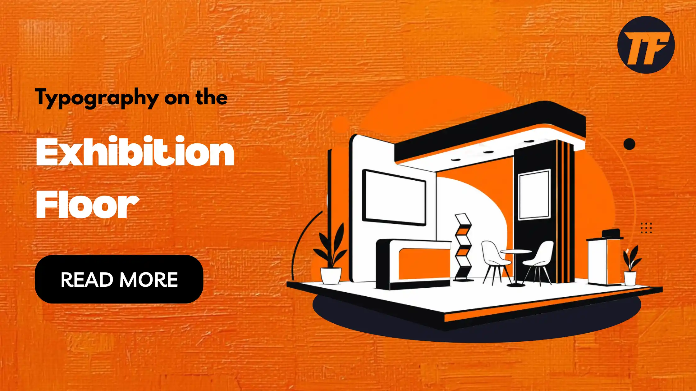
Typography on the Exhibition Floor: The Underrated Design Lever
Walk any trade show floor and one thing becomes obvious…
Designers focus too much time and money on structure, lighting, and giveaways. But signage? Nobody cares. That's a big mistake.
Typography is the unsung hero of every successful booth. Typography will either make people stop and read…or squint and walk away. The best part is that improving it won't cost you more dollars, just better decisions.
Typography Draws People In – Here's How You Can Use It To Boost Your Exhibit Design & Brand
Here's the breakdown:
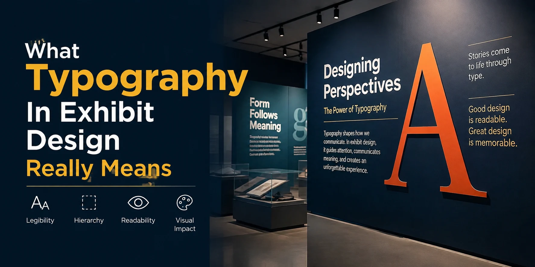
What Typography In Exhibit Design Really Means
Why It Matters More Than You Think
The Typography Rules That Actually Work
Common Typography Mistakes To Avoid
What Typography In Exhibit Design Really Means
Typography in exhibit design is more than picking a nice font.
Typography is the complete look of how your words appear on your stand – the fonts used, point sizes, tracking, hierarchy and color. When applied effectively, people should be able to read your message from the other side of the room. If it's done incorrectly your booth will just be seen as visual clutter.
Great typography does three jobs:
Communicates: It tells visitors what you do in seconds.
Persuades: It signals credibility, tone, and personality.
Directs: It guides the eye to the most important message first.
Top custom exhibition stand builders regard typography as a primary branding element, not an afterthought. They understand that typography in exhibit design makes or breaks branding.
Why Typography Matters More Than You Think
Here's the kicker: visitors barely give your booth a chance.
Research has indicated that visitors know within 6 seconds whether or not they want to visit your stand. Six. Seconds. During that brief moment they aren't reading pages of text – they are reading shapes, colors and words.
Here's another gut punch. Studies found that 66% of users will make a brand judgment based off typography alone.
Let that sink in.
Two-thirds of your aisle-walking shoppers are silently judging if your brand feels cutting-edge, cheaply made, luxurious, outdated, or reliable - based solely on your typography. Nothing else on your package has spoken yet.
Powerful typography does most of the work before your employees even grin. It performs when each person is:
Comparing you to the booth next door
Deciding if you are worth a conversation
Snapping quick photos for their team back home
Poor typography fails you at the worst possible time. It cheapens high-end products. It turns fantastic copywriting into wallpaper.
The Typography Rules That Actually Work
Now for the fun part…
Walk through these typography rules that will ALWAYS impress on the showroom floor. These aren't assumptions. They're proven by what SETS THE BEST STANDS APART, again and again.
Prioritize Readability From 15 Feet Away
Most exhibit copies are designed at a desk on a laptop screen.
Big mistake.
Your headline must be readable from 15 feet away, not 15 inches. That translates to larger sizes, heavier weights, and greater contrast than you would ever consider using online. Here's a simple test:
Print the design at real size
Step back across the office
If you cannot read the headline in one glance, make it bigger
Simple, right?
Build A Clear Type Hierarchy
Hierarchy is the invisible ladder that walks a visitor's eye through your stand.
The best booths use three levels of type – no more:
A massive headline that says what you do
A medium sub-headline that says who it is for
A smaller support line for the detail
If all is loud, nothing is loud. Choose what is most important and amplify it. Let the rest subtly blend in.
Match Type To Brand Personality
Every typeface has a voice..
A thin geometric sans-serif looks modern and technical. A chubby rounded font looks friendly and approachable. Tall serifs look premium and established. That voice should align with your brand story. A luxury skincare brand shouldn't use a fat arcade font. It'll puzzle consumers – even if they can read the words clearly. Typography Designs matter because each typeface has a distinct personality.
Ask yourself:
Does this typeface sound like our brand?
Would our best customer trust it?
Does it work next to our logo?
When your typography designs align with your brand voice, everything clicks. The typeface becomes an invisible ambassador that signals credibility before your copy even registers.
Use White Space Like A Pro
This one is overlooked so often it is frustrating.
Packing every inch of your stand with text is death to readability. White space (the empty space around letters) allows words to breathe and be easily digested. Try to:
Generous margins around every headline
Line height at least 1.5x the font size
Only one main message per graphic panel
Common Typography Mistakes To Avoid
Even great exhibitors get typography wrong.
Here are the traps to sidestep before you sign off on your final artwork.
Too Many Fonts
Three fonts should be the ceiling.
If you use any more fonts, your stand will start to look like a ransom note. Use one headline font, one body font, and (optionally) one accent font for highlights.
Low Contrast Colours
Pale grey text on a white wall might look sleek in Figma…
…and put it out there on the show floor under super-bright lights, it vanishes. Test all type-on-graphics combinations outside (or under bright lights indoors). Dark text on light background, or light text on dark. No compromises.
Squished Or Stretched Type
Never stretch a font horizontally or vertically to make it fit.
It ruins the font's design and yells "amateur" from down the aisle. Scale the entire word if it's too long, edit the copy to be shorter, or choose a naturally narrow font.
All Caps For Long Copy
CAPITAL LETTERS ARE HARDER TO READ IN LONG LINES.
Use only for short headlines or one-word callouts. Longer copy should be sentence case so readers can scan faster. (Readers will be tired.)
Bringing It All Together
Typography is the most affordable upgrade you can make to a stand.
It doesn't need more budget, or more structure, or more staff. It just needs smarter decisions. And when you make those decisions...wow. The reward is tremendous:
More visitors stop
More brands remember you
More conversations turn into leads
To quickly recap what makes typography in exhibit design work:
Design headlines to be readable from 15 feet
Build a clear three-level hierarchy
Match the typeface to the brand's personality
Use generous white space
Avoid excessive fonts, low contrast, stretched type, and long passages in all caps.
Dot these tiny decisions correctly and your alphabet wallpaper will sell half your business before a handshake ever occurs. It is that simple.
Conclusion
Typography isn't a luxury, it's your highest-ROI branding tool. Sixty-six percent of visitors judge your brand on type alone within six seconds. Readability from 15 feet, clear hierarchy, matching your brand voice, and smart white space transform your booth into a silent salesman that works before handshakes happen.
These decisions cost nothing extra, just better thinking. Stop treating typography as an afterthought and watch conversions climb.

Admin
Admin is a professional and creative specializing in the latest stylish font styles for social media and brand promotion. With a passion for modern typography and digital trends, Admin helps users create eye-catching text that stands out online.