Content

How to Design an Onboarding Flow Without a Designer as a Solo Founder
A solo founder does not need a full design department to plan a useful onboarding flow. The harder part is deciding what a new user must understand, do, and achieve before the product starts feeling useful. That makes onboarding a product problem first. Screens come later.
Research can prevent many early mistakes. A founder can visit Page Flows to study recorded onboarding flows and app screens from real web, iOS, and Android products.
The goal is not to reproduce another product. It is to see how different products introduce value, request information, and move users toward a first useful action. In this article, we will explore practical ways to design an effective onboarding flow without relying on a professional designer.
Why Solo Founders have to Use Creative Ways to Design an Onboarding Flow
Solo founders often manage product development, marketing, customer support, and design without a dedicated team. Building an effective onboarding flow can therefore be challenging, especially when it requires research, wireframing, prototyping, and user testing.
Creative approaches can help reduce this workload. Founders can study existing onboarding flows, use simple design and prototyping tools, experiment with creative font, apply proven UX patterns, and test early ideas with a small group of users. These methods help identify unnecessary steps and usability issues while keeping the process practical and focused on getting users to value quickly.
How Solo Founders Design an Onboarding Flow without a Professional Designer
Since solo founders often have limited design resources and have to handle multiple responsibilities, they have to use different creative strategies to design an onboarding flow without a professional designer.
Define the First Valuable Action
Start by naming the first action that proves the product works. Keep that answer concrete. A scheduling product may need a user to create a booking link. An invoicing product may need the first invoice created.
A writing product may need the first document completed. Registration itself rarely represents the useful outcome. Every onboarding step should support the chosen action. Remove steps that serve no immediate purpose. This gives the flow a clear finish line.
Research Existing Onboarding Before Drawing Screens
Look at products solving a similar user problem. Then look beyond direct competitors. A different category may handle permissions or set up better.
Record the order of important actions. Note when users create accounts. Check when preferences are requested. Watch how empty states are handled. Look at what happens immediately after setup.
Do not turn the research into screenshot collecting. Write down the decision behind each interesting screen. One product may explain benefits before requesting information. Another may let users enter the product immediately.
A third may ask several setup questions first. Those are different product decisions. Ask what each approach helps accomplish. Then decide which question matters for your own product.
Build the Smallest Flow That Reaches Value
Write the flow as actions before designing screens. Start with arrival. End at the first valuable action. Keep every step between those points visible. Do not worry about visual polish yet. This makes unnecessary steps easier to notice. A six step flow can often become four. Fewer decisions also make testing easier.
Separate required information from useful information. A name may be needed now. A profile photo may not be. Preferences can sometimes wait until later.
Tutorials can also wait until their feature becomes relevant. Early onboarding has limited attention available. Spend it on progress toward value. Move secondary setup outside the critical path.
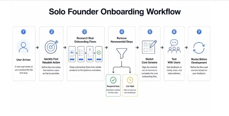
Now sketch one simple screen for each remaining step. Paper is enough for the first pass. Basic rectangles and labels work too. Each screen should have one obvious next action. Error cases can be noted beside it. Add a back route where users may reconsider something. Do not solve every future state yet. The purpose is to make the core journey testable.
Test the Flow Before Development
A clickable prototype can reveal usability problems before development begins. Give users a realistic task without explaining where to click, then observe hesitation, wrong turns, questions, and whether they reach the first valuable action. Even a small number of testers can reveal important issues.
Test language as carefully as navigation. Founders may understand their own terminology, while new users may not. Replace internal or unclear terms with familiar language and test the revised wording again. Small language problems can block an otherwise simple flow.
Review the information requested during onboarding as well. Ask why each field is needed and whether it is necessary at that stage. Move profile details, preferences, and other nonessential information later when possible to keep the initial setup focused.
Focus on what users do rather than whether they say they like the experience. A tester may praise a screen but still misunderstand it. Record where users struggle, fix the biggest obstacle first, and run another small test to see whether the change works.
Use the Right Typography
The right typography can make an onboarding flow easier to understand and navigate. Choose readable fonts, clear headings, and suitable text sizes. Use spacing to separate instructions, supporting text, and important actions.
Keep the typography consistent across screens. Avoid using too many fonts, styles, or sizes, as they can make the interface harder to scan. A simple hierarchy helps users quickly identify what to read and what action to take next.
Pay attention to the length of text on each screen. Keep instructions concise and break longer explanations into smaller sections when necessary. Button labels should clearly describe the next action, while supporting text should provide only the context users need at that point.
Treat Onboarding as a Product Decision
Onboarding can expose product problems early. A complicated setup may reflect complicated product rules, while an unclear first action can signal unclear positioning. Founders can often improve the flow by simplifying these decisions rather than adding more design elements.
Defaults also deserve attention.
Every choice adds friction, so use sensible defaults when early input is not essential. The same applies to education. Instead of explaining every feature upfront, use short hints, empty states, and contextual guidance when users need it.
Measure the flow after launch by tracking where users leave or stop completing setup. Compare these points with earlier testing and fix one meaningful obstacle at a time. Stable measurement makes it easier to evaluate whether each change improves the onboarding experience.
Conclusion
A solo founder can design an effective onboarding flow without a professional designer by focusing on clarity, simplicity, and user behavior. Define the first valuable action, remove unnecessary steps, research existing flows, and test the experience before development.
Use clear typography and sensible defaults to reduce friction. With these practical approaches, founders can create onboarding that guides users to value without requiring a full design team.
Frequently Asked Questions (FAQs):
1. What is the first step in designing an onboarding flow?
Start by identifying the first valuable action a user should complete. This gives the onboarding flow a clear goal and helps remove unnecessary steps.
2. How can solo founders research onboarding flows?
They can study onboarding flows from similar products and other product categories. They should focus on the decisions behind each screen rather than simply collecting screenshots.
3. Why should an onboarding flow have fewer steps?
Fewer steps reduce the number of decisions users need to make. This helps users reach the first valuable action more quickly.
4. How can solo founders test an onboarding flow?
They can give users a realistic task and observe where they hesitate, make mistakes, or stop. The founder can then fix the biggest issue and test the flow again.
5. How does typography affect an onboarding flow?
Clear typography helps users understand instructions and identify important actions. Consistent fonts, sizes, spacing, and headings also make screens easier to scan.

Admin
Admin is a professional and creative specializing in the latest stylish font styles for social media and brand promotion. With a passion for modern typography and digital trends, Admin helps users create eye-catching text that stands out online.