Content
- What Are Cursive Fonts
- Cursive vs. Script vs. Handwritten Fonts
- How Cursive Fonts Add Personality to Digital Designs
- How to Get Cursive Fonts with Text to Font
- Where Cursive Fonts Are Commonly Used in Digital Design
- How to Choose a Cursive Font That Matches Your Brand
- Using Cursive Fonts on Digital Screens
- Best Practices for Using Cursive Fonts Effectively
- Common Mistakes to Avoid
- When Not to Use Cursive Fonts
- Conclusion
- Frequently Asked Questions (FAQs):
How Cursive Fonts Add Personality to Digital Designs
Having attractive designs is not enough for brands these days. If companies want to make an impact in the market, they have to make sure their designs have personality. This is where cursive fonts come into the scene.
With their unique look, they make designs feel more personal and memorable. If you want to learn more about how cursive fonts add personality to digital designs, you’re in the right place. In this article, we will discuss what cursive fonts are, how they add personality to digital designs, and how you can use them for your designs effectively.
Let’s start.
What Are Cursive Fonts
Cursive fonts are typefaces with connected, flowing letterforms designed to imitate natural handwriting. Instead of standing apart like regular print letters, the characters link together in smooth strokes, giving the text a sense of movement and rhythm.
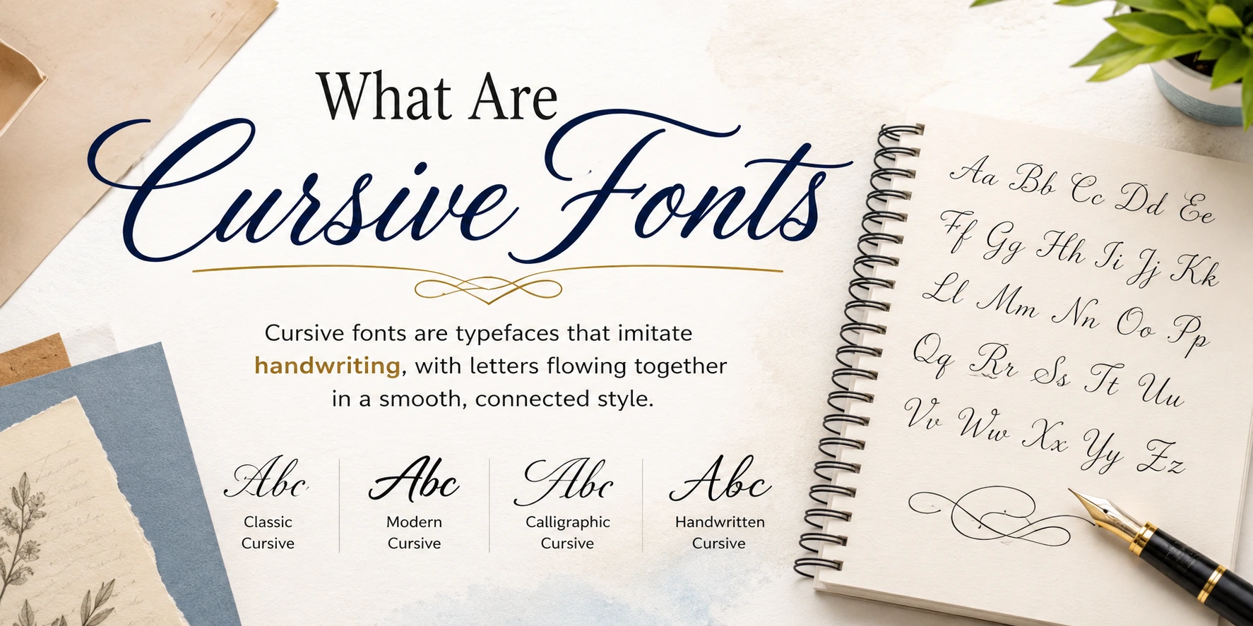
This handwritten quality is what separates cursive from more rigid typefaces. It carries the feel of something written by a person rather than generated by a machine, which is exactly why it plays such a strong role in design.
Cursive vs. Script vs. Handwritten Fonts
These terms are often used interchangeably, but they are not the same.
Cursive fonts have connected letters that flow like natural handwriting.
Script fonts is a broader category that includes cursive along with calligraphic and brush-style designs.
Handwritten fonts replicate casual, everyday writing and may not always have connected strokes.
Understanding the difference helps you pick the right style for the tone you want to create.
How Cursive Fonts Add Personality to Digital Designs
Cursive fonts do more than decorate a page. They can change how a design feels and help a brand communicate its personality before visitors read the full message.
Making Designs Feel More Personal
Cursive fonts resemble handwriting, so they can make digital content feel more personal and human. Their connected letterforms create a sense of warmth that standard fonts may not provide.
This makes cursive useful for brands that want to appear friendly, creative, elegant, or handmade. A cursive heading can make a website, social post, or graphic feel less formal and more personal.
Creating Different Feelings
The style of a cursive font affects the feeling it creates. Simple and elegant styles can suggest sophistication, while playful designs can make content feel more friendly and fun.
Consider the personality you want your design to communicate:
Elegant cursive: Creates a refined and luxurious feel. It works well for jewelry brands, weddings, beauty businesses, and premium products.
Playful cursive: Creates a friendly and cheerful feel. It suits lifestyle brands, children's products, and social media graphics.
Bold cursive: Creates a confident and energetic feel. It can work well for logos, promotional graphics, and attention-grabbing headlines.
Simple cursive: Adds a personal touch without making the design feel overly decorative. It can suit modern brands, websites, and digital content.
The key is to choose a style that supports the message you want your design to communicate.
Helping Brands Stand Out
A distinctive cursive font can become part of a brand's visual identity. Its flowing letterforms can make a logo, heading, or social media graphic easier to recognize.
This is especially useful when a brand wants to look different from competitors using common sans-serif or serif fonts. When the same cursive style is used consistently, it can also help people associate that visual style with the brand.
How to Get Cursive Fonts with Text to Font
You do not need to install a separate font file to create cursive text for digital designs. Text to Font is a free font generator and text stylizer that can turn regular text into different styled versions, including cursive text.
To create cursive text, simply enter your plain text into the tool. It automatically converts your text into a cursive-style version that you can copy and use in your designs, social media posts, usernames, or other digital content.
The process is simple:
Enter your text: Type or paste your regular text into the Text to Font tool.
Choose a cursive style: Browse the available text styles and select a cursive version that fits your needs.
Copy the result: Copy the generated cursive text and paste it wherever you want to use it.
This makes Text to Font a simple option for anyone who wants cursive text without manually searching for or installing a font.
Where Cursive Fonts Are Commonly Used in Digital Design
Cursive fonts show up across several areas of digital work, each for a slightly different reason.
Logos and brand marks: A cursive logo can make a business feel more personal, especially for brands built around craftsmanship or service.
Website headers and hero sections: A short cursive phrase draws the eye and sets the tone before visitors read further.
Social media graphics: Cursive adds visual interest to quotes and captions where personality matters more than pure clarity.
App and UI accents: Used sparingly, cursive can make onboarding screens or welcome messages feel warmer.
Email marketing and digital invitations: Cursive headers make announcements feel more thoughtful and less automated.
How to Choose a Cursive Font That Matches Your Brand
The right cursive font should match your brand, audience, and message. Consider these points before choosing a style:
Consider your brand personality:
Choose a font that reflects how you want people to see your brand. A relaxed cursive style can suit a handmade business, while an elegant style may work better for a luxury brand.
Think about your audience:
Consider what your target audience expects from your brand. A playful cursive font may appeal to a younger audience, while a refined style may suit a professional or premium audience.
Match the font to your industry:
Different industries call for different visual styles. A bakery may use a warm, handwritten font, while a beauty or jewelry brand may prefer a more elegant script.
Choose the right level of decoration:
Simple cursive fonts are easier to read and can work well for modern brands. Ornate styles can create a more formal or luxurious look but may feel out of place in casual designs.
Check how it works with your other fonts:
Cursive should complement the rest of your typography. Pair it with a clean serif or sans-serif font to create a clear visual hierarchy.
Keep your branding consistent:
Once you choose a cursive style, use it consistently across logos, social media graphics, headings, and other brand materials where appropriate.
Using Cursive Fonts on Digital Screens
Cursive fonts behave differently on screens than they do in print, and this is where many designs run into trouble.
Legibility and Readability on Screens
Screen resolution and small sizes can make delicate cursive strokes blur or disappear. Fonts that look elegant at large display sizes often lose clarity when shrunk down for body text or captions. For this reason, cursive works best for headlines and short phrases rather than long paragraphs.
Responsive and Mobile Scaling
A cursive font that looks great on a desktop screen can turn illegible on a small phone display. Test your chosen font across different breakpoints and device sizes before finalizing any design.
Accessibility Considerations
Cursive fonts should never be used for critical or functional text like buttons, form labels, or instructions. These elements need to be instantly clear to every user, including those with visual or reading difficulties.
Reserve cursive for decorative or emotional moments, not for anything users depend on to complete a task.
Best Practices for Using Cursive Fonts Effectively
Use cursive as an accent, not the foundation of the entire design.
Pair it with a clean sans-serif or serif font to create contrast and hierarchy.
Limit cursive to headlines, logos, or short phrases rather than long blocks of text.
Test the font at its actual display size before committing to it.
Make sure the font's tone matches the brand's overall personality.
Common Mistakes to Avoid
Overusing cursive across long text: This tires the eyes and slows reading speed.
Mismatching tone and brand: A playful cursive font on a formal brand creates confusion instead of connection.
Skipping device testing: A font that reads fine on one screen may fail completely on another.
Ignoring color contrast: Low contrast between cursive text and its background makes an already delicate font harder to read.
When Not to Use Cursive Fonts
Cursive is not suited for every context. Avoid it for dense, informational content where readability is the priority, such as articles, documentation, or product descriptions. Highly technical or corporate interfaces usually call for cleaner, more neutral typography that keeps the focus on function.
Accessibility-critical interfaces, like checkout forms or navigation menus, should also avoid cursive entirely. Be cautious with cursive in multilingual content too, since some scripts do not render consistently across different character sets.
Conclusion
Cursive fonts can give digital designs a distinct visual identity and make them easier to remember. The right style can communicate elegance, creativity, warmth, or a more personal brand personality.
Good typography also depends on balance, so cursive should complement rather than compete with the rest of the design. Use it for logos, headings, and short phrases, and keep longer or functional text in a clear, readable font.
Frequently Asked Questions (FAQs):
Do cursive fonts work well on mobile devices?
They can, but only if tested carefully at small sizes. Simpler, less ornate cursive styles tend to hold up better on mobile screens than highly decorative ones.
What's the difference between cursive and script fonts?
Cursive fonts specifically mimic connected handwriting, while script is a broader category that also includes calligraphic and brush-style fonts. All cursive fonts are scripts, but not all scripts are cursive.
How much cursive text is too much on a webpage?
Cursive should generally be limited to headlines, short phrases, or accents rather than full paragraphs. Long blocks of cursive text slow down reading and reduce usability.
Can cursive fonts hurt accessibility?
Yes, if used for critical text like buttons or instructions, since they can be harder to read quickly. It is best to reserve cursive for decorative elements and use clear fonts for anything functional.
What fonts pair well with cursive in digital design?
Clean sans-serif or simple serif fonts pair well with cursive because they create contrast without competing for attention. This combination keeps the design balanced and easy to navigate.

Admin
Admin is a professional and creative specializing in the latest stylish font styles for social media and brand promotion. With a passion for modern typography and digital trends, Admin helps users create eye-catching text that stands out online.