Content
- Why PDF Translation Can Change the Layout?
- Check Whether the Font Supports the Target Language
- Tables Are a Good Test of the Finished PDF
- Scanned PDFs Need Accurate OCR First
- Watch Headings, Captions and Text Alignment
- Check Readability After Translation
- When Does a Human Need to Review the Translation?
- Final Thoughts
How to Check an AI-Translated PDF for Fonts, Layout, and Readability
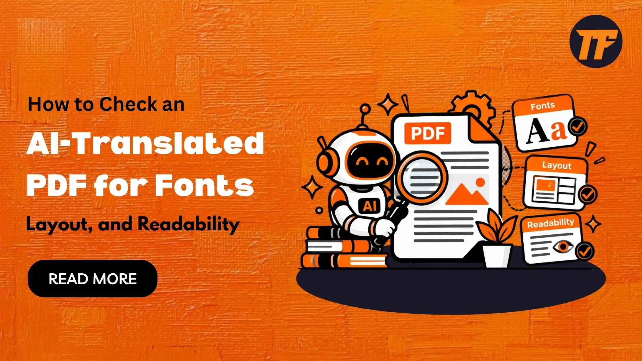
An AI-translated PDF can be accurate in terms of language but still have problems with its design and readability. Longer translated text can change line breaks, fonts may not support all characters, and tables or text boxes can become difficult to read.
Before sharing or publishing an AI-translated PDF, it is important to check more than the translated words. You should review the fonts, spacing, tables, alignment, images, and overall page structure to make sure the document still works as intended.
This guide explains what to check in an AI-translated PDF and how to spot common font, layout, and readability issues.
Why PDF Translation Can Change the Layout?
A PDF is designed around text of a particular length. Translation changes that length.
A short heading in one language may need several more words in another. A button label, table heading, caption, or paragraph can therefore extend beyond the space originally assigned to it.
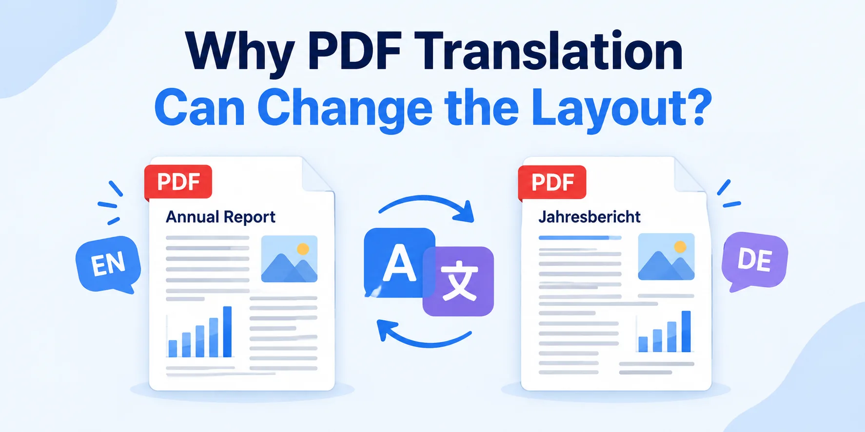
Document-focused platforms try to account for this when rebuilding the file. For example, a tool designed to translate the PDF using AI can translate the text while reconstructing elements such as tables, images, and the original layout. Even when layout preservation is supported, the exported PDF should still receive a visual check. Smartcat itself notes that complex tables, specialized fonts, and some right-to-left layouts may need adjustment.
The more tightly designed the original PDF is, the more important this review becomes.
Check Whether the Font Supports the Target Language
A font that works perfectly in English may not contain the characters needed for another writing system.
When the required characters are unavailable, software may substitute another font. The text remains visible, but the translated section can suddenly look different from the rest of the document.
This is particularly important when translating documents that rely on branded or specialized typefaces.
After translation, check:
headings
bold and italic text
numbers and punctuation
accented characters
symbols
non-Latin scripts
captions and footnotes
Font fallback is not simply a visual issue. The W3C notes that inappropriate font fallback can affect how writing systems are represented and may lose functional or regional characteristics associated with a typeface.
If the original font lacks the required characters, use a suitable font with broader language support rather than forcing the original typeface everywhere.
Tables Are a Good Test of the Finished PDF
Tables quickly reveal whether a translated PDF has handled structure properly.
A simple table may survive without noticeable changes. A dense table with narrow columns, long labels, numbers, and several levels of headings is more difficult.
Check that:
text remains in the correct cell
headings still match their columns
numbers have not shifted into another row
translated labels fit without overlapping
text remains large enough to read
Smartcat's current PDF guidance says table structure can be preserved, but complex tables may still require minor alignment adjustments after translation.
For reports, manuals, catalogs, and specification sheets, review at least the most complicated tables rather than assuming that a correct first page means every page is correct.
Scanned PDFs Need Accurate OCR First
Not every PDF contains selectable text.
A scanned contract, certificate, old report, or paper form may simply contain images of pages. Before AI can translate the words, optical character recognition (OCR) has to identify them and convert them into machine-readable text.
Adobe explains that scanned PDFs initially contain image data rather than searchable text and recommends reviewing OCR results for accuracy after recognition.
This creates an extra point where errors can occur.
If OCR reads a character or word incorrectly, the translation system receives the wrong source text. A fluent translation cannot correct an error it does not know exists.
For scanned PDFs, check the extracted text particularly carefully around:
names
dates
reference numbers
small print
tables
low-quality scans
unusual characters
A cleaner source scan usually gives the translation process a better starting point.
Watch Headings, Captions and Text Alignment
Body paragraphs are not the only text that needs checking.
Headings and captions often have less available space, so text expansion becomes more noticeable there. Look for headings that suddenly wrap awkwardly or captions that move too close to images.
Alignment also matters when the target language uses a different writing direction.
Right-to-left languages can require more than translating individual words. The direction and positioning of text may need adjustment across headings, tables, labels, and other page elements. Smartcat specifically notes that some complex RTL layouts may require manual correction.
Review the page as a complete design rather than checking each translated sentence in isolation.
Check Readability After Translation
A translated PDF can preserve all its content and still become harder to read.
Look at the finished document at normal viewing size. Body text should remain comfortable to read without zooming simply because the translation required more room.
Check:
font size
line spacing
paragraph spacing
line breaks
heading hierarchy
text alignment
contrast
crowded text boxes
Avoid introducing several substitute fonts just to make individual sections fit. Consistent typography makes a long document easier to follow.
This is also why typography should be tested with real multilingual content rather than placeholder text. Our guide to typography in modern software interfaces explains how longer translated phrases and fallback fonts can expose layout problems that may not appear in the original language.
When Does a Human Need to Review the Translation?
The amount of review should depend on how the PDF will be used.
An internal document that helps a team understand general information may not need the same review process as a contract, regulatory document, customer-facing brochure, or technical manual.
Human review becomes more important when an error could change:
a legal obligation
a safety instruction
a technical specification
a price or measurement
a product claim
information published to customers
The visual review is separate from the language review. A linguistically correct document can still contain clipped text or broken tables, while a visually perfect PDF can still contain a translation error.
For important documents, check both.
Final Thoughts
AI translation can save time, but the finished PDF still needs a careful review. Check fonts, spacing, tables, headings, alignment, and readability to catch problems caused by text expansion or unsupported characters.
Scanned PDFs also need extra attention because OCR errors can affect the translation. For important documents, review both the language and visual layout before sharing or publishing the final PDF.

Admin
Admin is a professional and creative specializing in the latest stylish font styles for social media and brand promotion. With a passion for modern typography and digital trends, Admin helps users create eye-catching text that stands out online.