Content
- What are Cursive Fonts?
- Characteristics of Cursive Fonts
- History of Cursive Typography
- Major Types of Cursive Fonts
- Where to Use Cursive Fonts
- Styling Your Cursive Fonts with Text to Font
- Where NOT to Use Cursive Text
- Key Tips for Picking the Right Cursive Font
- Pairing Cursive Fonts with Other Attractive Text Styles
- Best Practices for Using Cursive Text
- Conclusion
- Frequently Asked Questions (FAQs):
Cursive Fonts Guide: Types, Uses, & Best Practices
Have you ever noticed how many designs and texts use cursive fonts online? There’s a specific reason for that. When you use cursive fonts, it adds a sense of elegance, personality, and visual flow to the text. It makes the text instantly stand out and capture the attention of the reader.
With the right use, these fonts can help improve the overall visual appeal and make your message more expressive.
In this guide, we are going to discuss what cursive font style is, how it’s useful, and how you can start using it for your designs and texts. Let’s start.
What are Cursive Fonts?
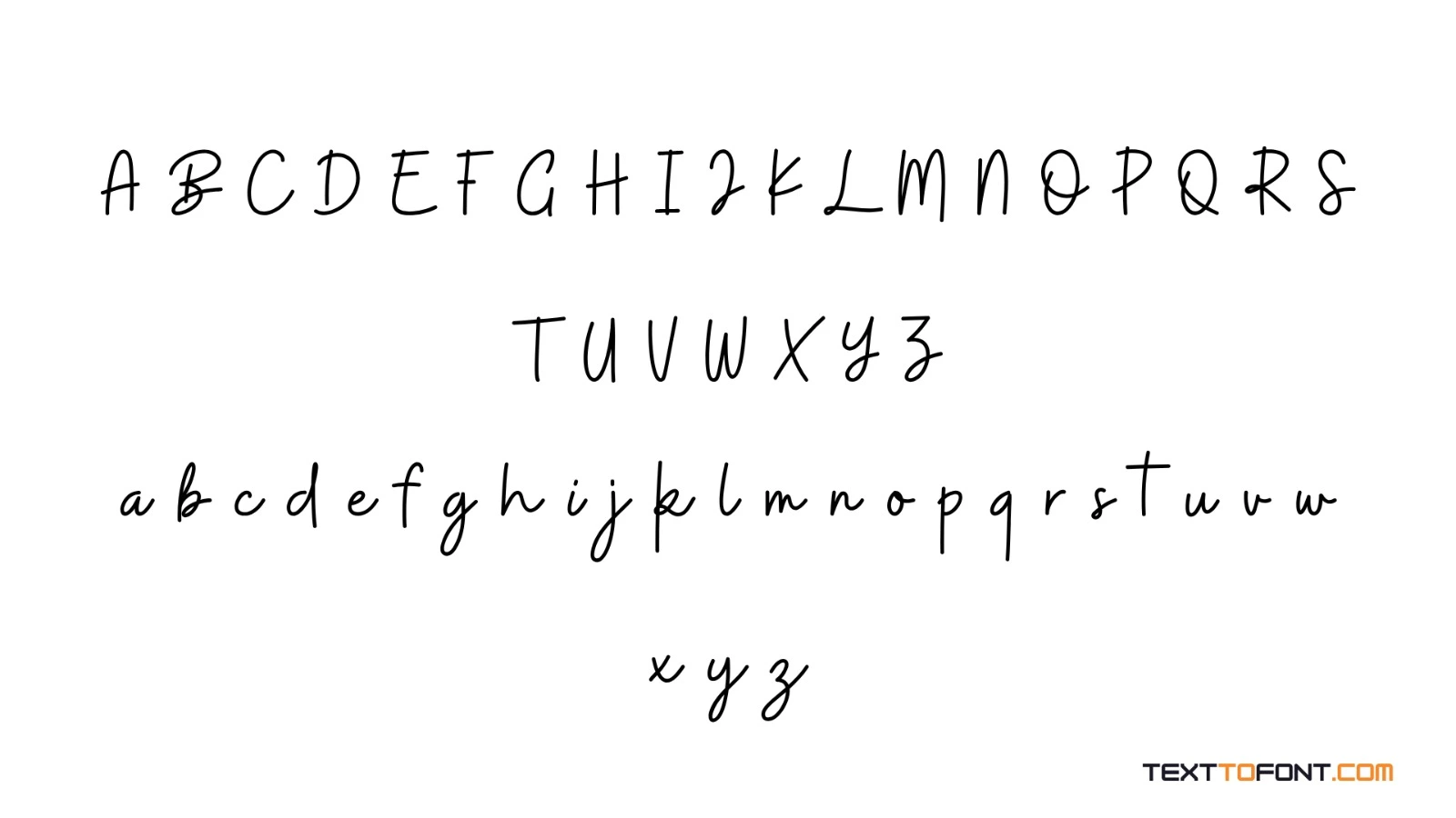
Cursive fonts are a style of typeface that imitates natural handwriting, where letters are often connected in a flowing and smooth manner. They are designed to look elegant, expressive, and more personal compared to standard fonts. These fonts are commonly inspired by traditional calligraphy and handwritten scripts.
In typography, cursive fonts are used to add character and emotion to text. They can range from formal and decorative styles to casual and modern handwriting styles. Because of their artistic appearance, cursive fonts are often used in designs where visual appeal and personality are more important than strict readability.
Characteristics of Cursive Fonts
Cursive fonts have a flowing, handwritten style that makes them look more natural, expressive, and decorative compared to standard typefaces.
Letters are often connected or closely linked together
Designed to mimic natural handwriting or calligraphy
Smooth, flowing strokes with varying thickness
More decorative and stylish than standard fonts
Can range from formal (elegant) to casual (handwritten) styles
Often used for emphasis or visual appeal rather than long reading text
Strong focus on aesthetic and emotional expression
History of Cursive Typography
Cursive typography has its roots in traditional handwriting and calligraphy, where writing was done by hand with flowing, connected letters. Before digital fonts existed, cursive styles were widely used in formal writing, manuscripts, and personal letters to create a smooth and elegant appearance.
Over time, these handwritten styles were adapted into printed typefaces and later transformed into digital fonts. Today, cursive typography is commonly used in design to bring a sense of elegance, personality, and artistic expression to visual content.
Major Types of Cursive Fonts
Cursive fonts come in different styles, each with its own look and purpose depending on how formal, decorative, or casual the design needs to be.
Formal cursive fonts: Elegant and traditional styles often used in invitations and official designs
Casual cursive fonts: Simple, handwritten-style fonts that feel relaxed and natural
Calligraphic fonts: Artistic and decorative fonts inspired by traditional calligraphy writing
Brush script fonts: Bold and expressive styles that look like they are created with a paintbrush
Modern script fonts: Clean and stylish cursive fonts designed for branding and digital use
Where to Use Cursive Fonts
Cursive fonts are best used in designs where style, personality, and visual appeal are more important than long-form readability. They help add elegance and creativity to text when applied in the right context.
Branding and Logos
Cursive fonts are often used in logo design to create a distinct and memorable brand identity. They help businesses stand out by giving their logo a more personal, elegant, or artistic feel.
This style is especially common in fashion, beauty, lifestyle, and boutique brands that want to communicate sophistication or creativity through their visual identity.
Invitations and Events
Cursive fonts are widely used in wedding invitations, greeting cards, and event posters to create a formal and decorative appearance.
Their flowing style adds a sense of celebration and elegance, making the design feel more special and personalized. They are especially effective for occasions where a refined and stylish tone is required.
Social Media Graphics
On social media, cursive fonts are often used to highlight quotes, captions, or short messages. They help make content more eye-catching and visually engaging in a crowded feed. When used properly, they can add personality and emotion to posts, making the message feel more expressive and relatable.
Packaging and Product Design
Brands often use cursive typography on product packaging to create a premium, handcrafted, or luxurious impression. It helps attract attention on shelves and communicates quality and style.
This is especially common in industries like cosmetics, food, and handmade goods, where visual appeal plays a key role in consumer interest.
Quotes and Highlighted Text
Cursive fonts are ideal for emphasizing short quotes, slogans, or key phrases within a design. They draw attention to important words and add a decorative touch without overwhelming the overall layout. This makes them useful for posters, websites, and promotional materials where selective emphasis is needed.
Styling Your Cursive Fonts with Text to Font
Cursive fonts already add elegance and personality to your text, but you can make them even more visually appealing with styling tools. One useful option is Text to Font, which allows you to transform your text by adding emojis, symbols, and emoticons to create a more stylish look.
This can help your cursive text stand out even more in designs, social media posts, or branding elements. You can try experimenting with different combinations to match the tone of your message and make your typography more creative and eye-catching.
Where NOT to Use Cursive Text
While cursive fonts are visually attractive, they are not suitable for every type of content. In some cases, they can reduce readability or make the design look less professional if overused.
Long Paragraphs or Body Text
Cursive fonts should not be used for long paragraphs or detailed content because they can be difficult to read for extended periods. The connected and decorative style may slow down reading speed and cause strain, especially in digital formats.
Professional or Technical Documents
In formal documents such as reports, resumes, or technical writing, cursive fonts are generally not appropriate. These settings require clarity and simplicity, where standard fonts are more effective and professional.
Mobile and Small Screen Content
Cursive text can become hard to read on smaller screens like smartphones or compact UI elements. The fine details and connected letters may lose clarity, affecting user experience and readability.
High-Information or Instructional Content
When the main goal is to communicate information quickly and clearly, cursive fonts are not ideal. They can distract from the message and make instructions or key details harder to understand.
Key Tips for Picking the Right Cursive Font
Choosing the right cursive font is important because it affects how readable, attractive, and suitable your design looks for its purpose.
Match the font style with the purpose: use formal cursive for elegant designs and casual cursive for relaxed content
Prioritize readability: choose fonts that are easy to read, especially for digital use
Consider your audience: pick a style that fits their expectations and preferences
Avoid over-decorative fonts: too much styling can make text hard to understand
Test different sizes: ensure the font remains clear in both large headings and smaller text
Pair wisely with other fonts: combine cursive with simple fonts like sans-serif for balance
Keep consistency: use the same cursive style throughout a design for a clean look
Pairing Cursive Fonts with Other Attractive Text Styles
Cursive fonts work best when they are paired with simpler and more readable typefaces to create balance in a design. Since cursive styles are often decorative and expressive, combining them with clean fonts like sans-serif or serif helps improve readability and visual hierarchy.
For example, cursive fonts can be used for headings or highlights, while a simple font is used for body text. This contrast ensures the design looks stylish without becoming overwhelming. Good font pairing helps maintain clarity while still allowing the cursive style to stand out effectively.
Best Practices for Using Cursive Text
Using cursive text effectively requires balance and careful design choices to ensure it remains attractive and easy to read.
Use cursive fonts sparingly: apply them mainly for headings, highlights, or short phrases
Maintain readability: choose styles that are clear and not overly decorative
Combine with simple fonts: pair cursive with clean fonts like sans-serif for better balance
Avoid long text blocks: keep cursive limited to short content for easier reading
Ensure proper spacing: adjust letter and line spacing for better clarity
Match the tone of the design: use elegant cursive for formal designs and casual styles for relaxed content
Check screen visibility: test how the font looks on different devices and screen sizes
Conclusion
Cursive fonts are a powerful design element that can add elegance, personality, and creativity to your text when used correctly. They work best for short, impactful content like logos, invitations, quotes, and social media graphics.
However, they should be used carefully to maintain readability and balance in design. By choosing the right style, pairing fonts wisely, and following best practices, you can make cursive typography both visually appealing and effective in communication.
Frequently Asked Questions (FAQs):
What are the different styles of cursive fonts?
Cursive fonts come in several styles, including formal, casual, calligraphic, brush script, and modern script fonts. Each style has a different level of elegance and is used for different design purposes.
Are cursive fonts easy to read?
Cursive fonts are easy to read when used in short text and clear styles. However, overly decorative cursive fonts can be harder to read in long content.
Where should I use cursive fonts the most?
Cursive fonts are best used in logos, invitations, quotes, and social media designs. They work well where style is more important than long-form readability.
Can cursive fonts be used in professional designs?
Yes, cursive fonts can be used in professional designs when applied carefully. They are often used in branding, especially for creative and lifestyle industries.
What fonts go well with cursive fonts?
Simple fonts like sans-serif or clean serif fonts pair best with cursive styles. This combination helps maintain balance and improves readability.

Admin
Admin is a professional and creative specializing in the latest stylish font styles for social media and brand promotion. With a passion for modern typography and digital trends, Admin helps users create eye-catching text that stands out online.