Content
Fonts That Are the Worst for Designing
Your design project's success or failure heavily depends on the chosen font selection.Your design project's success or failure heavily depends on the chosen font selection. Selection of text in design work matters because fonts generate emotional responses from readers and affect how they interpret information. Multiple design fonts available for beautiful projects contain some variants that ruin your present work immediately. This article presents the worst fonts for design application while explaining why such bad fonts should be strictly avoided.
1. Comic Sans

Over the years, Comic Sans has gained unwanted fame in design circles. The font, which was developed primarily for everyday discussions, gets regular criticism for its immature style. Professional designs must avoid employing Comic Sans typefaces because they remain reserved for kindergarten posters and comics-style creative work. This font lacks refined qualities and a flexible design approach essential for contemporary design practice.
Why Avoid Comic Sans:
- Overused and boring
- Hard to read in formal settings
- Looks unprofessional
2. Papyrus

Design professionals have developed a negative view of Papyrus because it appears across numerous design projects. Papyrus is an everyday choice for designing ancient-looking projects, yet its popularity as a font has diminished because of rampant deployment. The combination of uneven line spacing and an incorrect design plan makes Papyrus unappealing for current design fields.
Why Avoid Papyrus:
- Used too much in common designs like amateur 'spa' or 'nature' themes
- Old-fashioned and unprofessional style
- Difficult to combine with other fonts
3. Curlz MT

Curlz MT leads design professionals to regard it as one of the worst options for TextStyle because of its unrealistic decorative structure and playful appearance. Although it appears initially enjoyable, many design projects reject its decorative style due to unnecessary curved elements. It’s neither versatile nor readable.
Why Avoid Curlz MT:
- Difficult to read
- Limited use cases (e.g., children's parties)
- Not suitable for professional designs
4. Brush Script

Brush Script fails to achieve a sophisticated visual result by accepting handwritten calligraphy as inspiration. The large text fields of Brush Script become hard to decipher because the typeface combines steep slopes with unusual stylization. Field users often opt for Brush Script, although experts prefer different alternatives.
Why Avoid Brush Script:
- Poor readability
- Looks outdated
- Limited applicability in modern designs
5. Jokerman

Jokerman functions as an iconic font that loudly shouts, "Don't choose me." Due to its unusual design motifs, the font remains inappropriate for virtually all style requirements. Most professional designers avoid Jokerman because this typeface only suits limited usage in circus-themed projects, although it lacks professional quality.
Why Avoid Jokerman:
- Overly stylized and distracting
- Limited usability
- Unprofessional appearance
6. Impact (Overused, Not Always the Worst)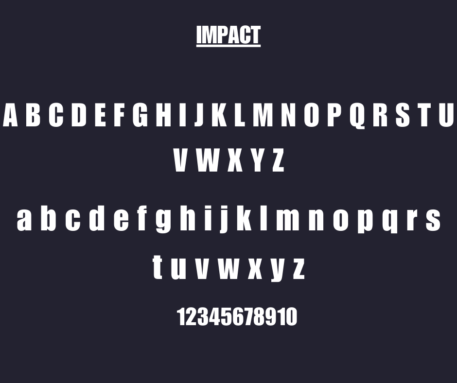
Impact's use as the primary typeface has become problematic since internet meme creators and amateur designers choose it so frequently. This thick, compact typeface works at times yet exudes dominance; it lacks sophisticated charm.
Why Be Cautious with Impact:
- Overused in internet memes
- Can feel too aggressive
- Hard to pair with other fonts
7. Times New Roman (When Overused)

The timeless appeal of Times New Roman exists despite its frequent employment leading to conventionality in modern designs and styled work. Times New Roman serves educational documents and official papers perfectly yet fails to meet creative design requirements.
Why Be Cautious with Times New Roman:
- Overused in formal contexts
- Lacks creativity
- Not modern or trendy
8. Arial (When Misused)

Because of widespread misuse in subpar project design work, Arial has become a controversial font type. It loses its appeal because it becomes dull when people don't pause to consider its use.
Why Be Cautious with Arial:
- Can feel generic
- Overused in amateur designs
- Lacks personality
9. Algerian

Algerian’s overly decorative and rigid style makes it a poor choice for most design projects. It’s hard to read and has very limited use cases.
Why Avoid Algerian:
- Poor readability
- Outdated and overly stylized
- Limited versatility
10. Viner Hand ITC

Viner Hand ITC seeks playful results but ends up appearing both messy and challenging to understand. The irregular pen strokes create physical characteristics that prevent its usage in professional design work.
Why Avoid Viner Hand ITC:
- Difficult to read
- Looks unprofessional
- Limited use cases
11. Chiller

Chiller's gothic design fits Halloween projects yet proves unsuitable for broad applications. The design features of this theme restrict its practical applications in various design scenarios.
Why Avoid Chiller:
- Extremely niche usage
- Hard to read
- Distracting design
12. Kristen ITC

The bubbly design of Kristen ITC typically creates an effect that is both childlike and unskilled. Most design situations lack the versatility needed for this font to succeed.
Why Avoid Kristen ITC:
- Too playful for professional designs
- Difficult to pair with other fonts
- Limited applicability
13. Stencil

Stencil provides a military-inspired design option suitable in select situations yet its rigidness and specialized nature makes it inappropriate for general design applications.
Why Avoid Stencil:
- Overly rigid
- Limited use cases
- Not suitable for modern designs
14. Old English Text

Readers find Old English text difficult to read because of its elaborate design. The high decorative font's design appeal conflicts with many contemporary aesthetic requirements.
Why Avoid Old English Text:
- Hard to read
- Extremely niche usage
- Not versatile
15. Hobo

The unique round shape and distinct visual style of Hobo's design give it an elevated yet unmodern professional appearance. Due to its unconventional appearance, modern design projects almost never benefit from using Hobo.
Why Avoid Hobo:
- Dated appearance
- Limited usability
- Difficult to pair with other fonts
How to Choose Better Fonts for Designing
Now that you know the fonts to avoid, here are some tips for choosing better fonts for your designs:
- Prioritize Readability: Always select fonts that are easy to read, even at smaller sizes.
- Match the Tone: Ensure the font matches the mood and purpose of your project.
- Limit Font Choices: Stick to 2-3 fonts per project to maintain a clean and cohesive design.
- Use Modern Fonts: Explore modern, versatile fonts like Roboto, Open Sans, or Lato.
- Pair Fonts Wisely: Combine serif and sans-serif fonts for a balanced look.
Final Thoughts
Fonts play a critical role in the success of any design project. While there are many amazing fonts out there, some like Comic Sans, Papyrus, and Curlz MT are best left untouched. By avoiding the worst fonts ever that are the worst for designing and choosing fonts that enhance your project’s message, you can create designs that truly stand out.
Remember, great design starts with great typography. Make wise choices and let your creativity shine!
Powered by Froala Editor

Admin
Admin is a professional and creative specializing in the latest stylish font styles for social media and brand promotion. With a passion for modern typography and digital trends, Admin helps users create eye-catching text that stands out online.