Content
- Always Use Stylish Fonts That Are Easy to Read
- Break Long Posts Into Small Paragraphs
- Use Symbols and Special Characters for Decoration
- Use Emojis to Highlight Important Information
- Do Not Overuse Emojis
- Keep a Consistent Style
- Always Match the Text Style With the Nature of the Post
- Best Readable and Stylish Text Styles for Facebook Posts
- Create Readable Stylish Text With Facebook Font Generator
- Pro Tips to Make Facebook Posts Stylish and Readable

How to Make Facebook Posts Stylish and Easy to Read
Facebook posts are a simple way to share updates, opinions, announcements, and other information with friends and followers. However, the way you format your text can affect how people read and respond to your posts. Plain text may get your message across, but adding stylish fonts, symbols, and emojis can make it more attractive.
The key is to keep your posts visually appealing without making them difficult to understand. You can achieve this by choosing readable fonts, breaking up long paragraphs, and using decorative elements carefully.
Always Use Stylish Fonts That Are Easy to Read
Stylish text can make your Facebook posts look different from ordinary text and help important words stand out. However, not every decorative style is suitable for everyday posts. Some Unicode characters have unusual shapes that can be difficult to recognize, especially when used in long sentences.
For example, simple styles such as 𝐍𝐞𝐰 𝐎𝐟𝐟𝐞𝐫𝐬, 𝑆𝑝𝑒𝑐𝑖𝑎𝑙 𝐴𝑛𝑛𝑜𝑢𝑛𝑐𝑒𝑚𝑒𝑛𝑡, and 𝓛𝓲𝓯𝓮 𝓘𝓼 𝓑𝓮𝓪𝓾𝓽𝓲𝓯𝓾𝓵 can give your posts a different appearance without adding too many decorative elements.
Here are a few things to keep in mind:
Choose characters that are easy to recognize.
Avoid styles with excessive decorations or unusual letter shapes.
Use stylish text for short phrases and important details rather than entire long posts.
Make sure the converted text remains understandable on different devices.
You do not need to change every sentence to make your post attractive. Styling a few important words or phrases is often enough.
Break Long Posts Into Small Paragraphs
Large blocks of text can make Facebook posts difficult to read, especially when people are scrolling through their feeds on mobile devices. Readers may skip your post if they cannot quickly understand its structure.
Breaking your content into smaller paragraphs makes it easier to follow. It also gives readers enough space to understand one point before moving to the next.
Consider these simple formatting practices:
Keep each paragraph focused on one main idea.
Use two to four sentences per paragraph when possible.
Add line breaks between different points.
Avoid placing several unrelated ideas in the same paragraph.
Use short headings to separate different sections in longer posts.
For example, if you are announcing a new product, you can use separate paragraphs for its introduction, features, price, and availability.
This simple change can make even a detailed Facebook post easier to scan and understand.
Use Symbols and Special Characters for Decoration
Symbols and special characters can add a decorative touch to your Facebook posts. They can also help separate different sections and draw attention to specific information.
You can use stars, arrows, hearts, checkmarks, and other characters to give your text a more interesting appearance.
Here are a few examples:
Stars: ★ New Collection Available ★
Arrows: ➜ Check Out Our Latest Offers
Hearts: ♡ Thank You for Your Support ♡
Checkmarks: ✓ Easy to Use
Decorative dividers: ✦ ━━━━━━━━━ ✦
You can place these symbols around headings, important announcements, or short messages. They work particularly well when you want to make a particular part of your post stand out.
However, avoid adding too many different symbols. A few well-placed characters can make your post look organized, while excessive decoration can distract readers from the actual message.
Use Emojis to Highlight Important Information
Emojis can make Facebook posts more expressive. They help communicate emotions, add personality, and highlight important information without requiring additional words.
You can use emojis in different parts of your posts depending on their purpose.
For example:
Announcements: 📢 We Have an Important Update!
Promotions: 🎉 Get 20% Off This Weekend!
Questions: 🤔 What Do You Think About This Idea?
Achievements: 🏆 We Reached Another Milestone!
Travel updates: ✈️ Ready for Our Next Adventure?
Emojis can also work as visual markers in posts that contain multiple points. For example, you can use a checkmark before each feature or a location pin before an address.
Choose emojis that match your message instead of adding random ones. This helps maintain a clear connection between your text and its visual elements.
Do Not Overuse Emojis
Although emojis can make your posts more interesting, using too many can affect readability. A sentence filled with different emojis may look cluttered and distract readers from your message.
For example, instead of writing:
🎉🔥😍 NEW SALE!!! 😍🔥🎉 GET YOUR FAVORITE PRODUCTS NOW!!! 🛍️💥🎁
You can keep it simple:
🎉 New Sale! Get Your Favorite Products at Special Prices.
The second example communicates the same message without unnecessary decoration.
Here are a few tips to keep emoji use under control:
Use one or two relevant emojis in a short post.
Place emojis at the beginning or end of important sentences.
Avoid adding emojis between every word.
Do not use several emojis that communicate the same idea.
Make sure emojis do not replace important words or information.
Remember that emojis should support your message, not become its main focus.
Keep a Consistent Style
Consistency helps your Facebook posts look organized and professional. If you frequently switch between different fonts, symbols, and decorative styles, your content may look messy.
For example, using bold lettering for a heading, cursive text for a short quote, and simple text for the main content can create a balanced appearance. However, changing the font style in every sentence can make the post difficult to follow.
You can maintain consistency by following a few simple practices:
Choose one or two font styles for each post.
Use the same type of symbols throughout the content.
Keep emoji placement consistent.
Apply similar formatting to headings and important phrases.
Avoid combining too many decorative elements.
A consistent style also helps maintain the appearance of your posts if you regularly share content on the same Facebook page.
Always Match the Text Style With the Nature of the Post
Not every Facebook post needs the same formatting. The style you choose should match the message you want to communicate and the people you want to reach.
For example, a personal update can have a casual appearance, while a business announcement may need a more organized format.
Here are some examples:
Personal updates: Use cursive or playful fonts with a few relevant emojis to give your message a personal touch.
Business announcements: Choose simple bold lettering for important details and keep the remaining text plain.
Promotional posts: Highlight discounts, product names, and special offers using bold fonts and suitable symbols.
Inspirational quotes: Try decorative or cursive lettering to give short quotes a distinctive appearance.
Educational posts: Use readable fonts, short paragraphs, and checkmarks to organize information.
Choosing a suitable style makes your posts more appropriate for their purpose. It also prevents unnecessary decorations from getting in the way of your message.
Best Readable and Stylish Text Styles for Facebook Posts
There are several font styles you can use to make your Facebook posts more attractive. However, some are more suitable for everyday communication than others.
Here are a few options worth trying:
Bold text: A good choice for highlighting important words, announcements, and short headings.
Italic text: Useful for adding subtle emphasis to particular words or phrases.
Cursive text: Suitable for quotes, greetings, and short personal messages.
Monospace text: Gives letters a typewriter-like appearance and works well for short creative messages.
Small caps: Uses smaller uppercase-style letters to create a distinctive appearance.
Decorative Unicode fonts: Offer different letter designs that can make ordinary text look more creative.
You should consider how easily people can recognize each style before using it. Bold and simple italic lettering are generally easier to read than highly decorative fonts.
Also, keep in mind that some fancy text styles use Unicode characters instead of standard font formatting. Their appearance and support can vary across devices and platforms.
Create Readable Stylish Text With Facebook Font Generator
Manually finding and combining different font styles can take time. You may also make mistakes when copying special characters or trying to create a consistent appearance.
In such cases, you can use Facebook Font Generator to create different text styles more easily.
Here’s how you can use it:
Open the official website of Facebook Font Generator.
Enter the text that you want to stylize.
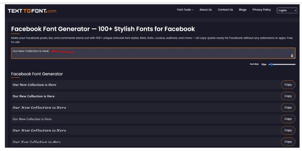
The tool will convert the simple text into multiple stylish versions.
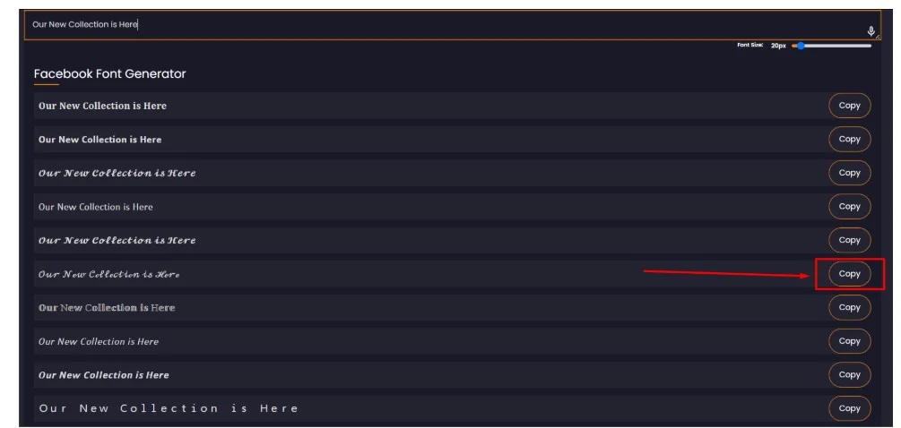
Pick a style that you like and click on the copy button to copy it.
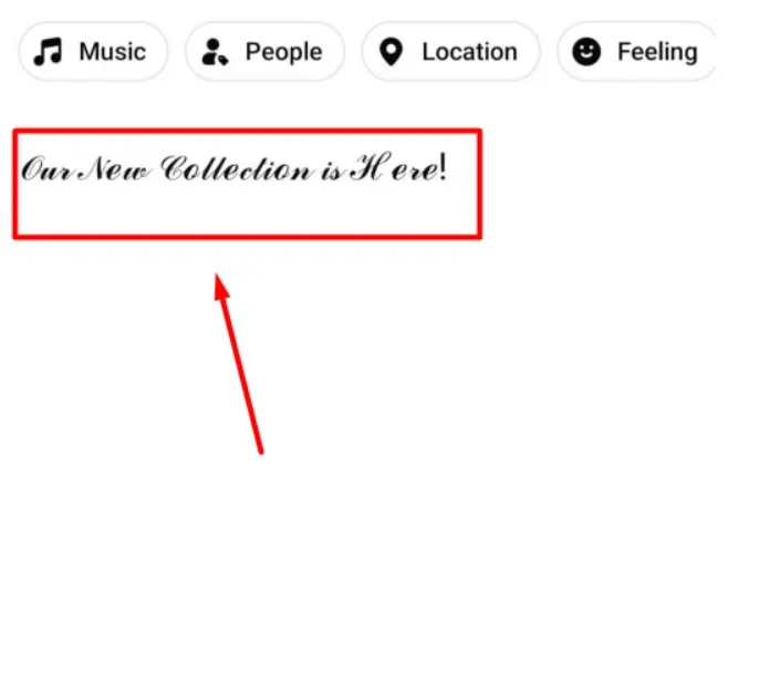
Now you can paste this text in your Facebook posts.
This makes it easier to experiment with different lettering styles without manually searching for individual Unicode characters. You can also compare several designs before choosing one that looks attractive and remains easy to read.
Pro Tips to Make Facebook Posts Stylish and Readable
Besides choosing suitable fonts and decorative elements, a few additional practices can help improve your Facebook posts.
Keep your opening sentence interesting: Start with a clear statement or question that tells readers what your post is about.
Highlight important information: Use bold or decorative lettering for details you want readers to notice quickly.
Use simple language: Avoid unnecessarily complicated words and long sentences.
Leave enough spacing: Separate different ideas so readers can follow your content without difficulty.
Check your post before publishing: Review the formatting, spelling, and placement of decorative characters.
Preview your content on mobile: Many people use Facebook on their phones, so make sure your post looks readable on smaller screens.
Avoid decorating every line: Leave some text in its original form to maintain a clear visual balance.
These practices can help you create posts that look attractive while keeping the message clear.

TextToFont Editorial Team
The TextToFont Editorial Team publishes practical guides, tutorials, contributed and partner content covering typography, font generators, Unicode text styles, digital design, creative software, and emerging technology. Each article is reviewed for relevance, accuracy, clarity, and usefulness before publication on TextToFont.