Content
- Typography Helps Users Understand an Interface
- Readability Should Guide Font Selection
- Software Modernization Should Include Typography
- Responsive Typography Has to Work Across Screens
- Accessibility Depends on Clear Text
- Consistency Makes Typography Easier to Use
- Where Expressive Typography Fits
- How to Test Typography With Real Content
- Final Thoughts
- Frequently Asked Questions (FAQs):
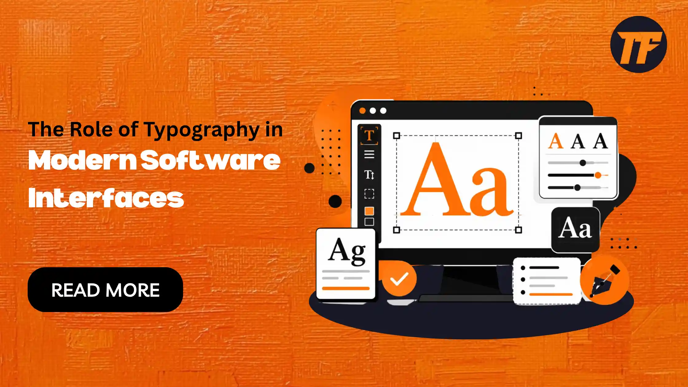
The Role of Typography in Modern Software Interfaces
A software interface can have powerful features and still feel difficult to use when information is poorly presented. Typography helps users identify headings, understand instructions, scan data, and recognize actions without adding more interface elements.
For modern software, typography is therefore part of usability. The right type system should make information clear across different screens while remaining consistent with the product's visual identity.
Typography Helps Users Understand an Interface
Software interfaces contain different types of information at the same time. A dashboard, for example, may include navigation, metrics, filters, tables, alerts, and action buttons.
Typography separates these elements visually.
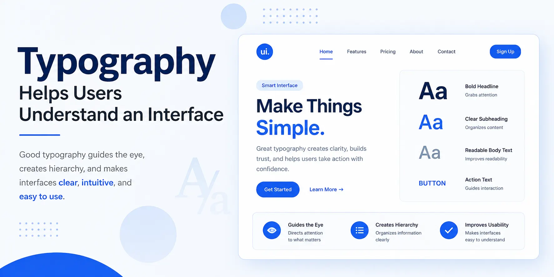
A page heading can use greater size or weight, while supporting information remains less prominent. Buttons and labels can follow their own consistent treatment. Users gradually learn these patterns and can navigate other parts of the product more quickly.
The purpose of hierarchy is not to make every element look different. It is to show users what deserves attention first.
Readability Should Guide Font Selection
A visually interesting font is not necessarily suitable for interface text.
Navigation labels, forms, buttons, tables, and instructions need to remain clear at relatively small sizes. More expressive fonts can work for selected headings or branding elements, but using them throughout an application can make information harder to scan.
Font selection should therefore consider the product, its audience, screen size, and the purpose of the text.
For a closer look at the main font categories and their characteristics, TextToFont's beginner's guide to fonts covers serif, sans-serif, script, monospaced, and display fonts.
Software Modernization Should Include Typography
Legacy applications were often designed for older displays, desktop-only workflows, or different usability expectations. As a result, they may contain dense layouts, small text, inconsistent headings, or outdated interface patterns.
Modernizing the underlying software without improving how information appears can leave part of that old experience intact.
Companies working on application development and modernization, such as corsactech.com, may address broader changes to software systems and digital products. From an interface perspective, modernization is also an opportunity to establish a clearer typography system that works with the updated product.
This is particularly useful when an older application is being adapted for modern browsers, mobile devices, or a new design system.
Responsive Typography Has to Work Across Screens
Modern applications are rarely used at one fixed screen size.
Typography that works on a desktop dashboard may need different sizing and spacing on a smartphone. Simply shrinking every element can result in crowded text and difficult-to-read controls.
Designers should test:
Font sizes
Line height
Line length
Heading proportions
Button and label text
Content density
These decisions should be tested with real interface content at different breakpoints rather than judged from a desktop mockup alone.
Accessibility Depends on Clear Text
Typography can also affect whether people can comfortably use an application.
Important information needs sufficient contrast, readable sizing, recognizable characters, and appropriate spacing. Error messages, security notices, payment details, form instructions, and primary actions should be especially clear.
Decorative text should not be relied upon for essential interface communication.
This does not mean every product needs visually identical typography. It means creative choices should not interfere with a user's ability to understand what the software is asking them to do.
Consistency Makes Typography Easier to Use
Consistency reduces the number of visual patterns users need to understand.
Instead of styling text separately on every screen, teams can define reusable treatments for:
Page headings
Section headings
Body text
Labels
Buttons
Captions
Alerts
These styles can become part of the application's design system and reusable components.
A consistent system also makes later changes easier. When typography rules are centralized, teams can improve sizing, spacing, or weights without manually redesigning individual screens.
Where Expressive Typography Fits
Most functional interface text should remain simple, but some software products have room for more expressive typography.
Creative applications, gaming platforms, profile customization features, and community products may allow users to personalize names or short pieces of content. In these situations, tools such as a text to font generator can demonstrate different text treatments for short creative uses.
The distinction is important: expressive text can complement a creative feature, while navigation, forms, instructions, and important actions should remain straightforward.
How to Test Typography With Real Content
Typography should be tested with the actual content and data that users will see. Placeholder text often hides problems that appear once the interface contains realistic information.
Test your typography with cases such as:
Long names and labels: Check whether text overflows buttons, cards, tables, or other components.
Large numbers: Make sure prices, metrics, dates, and other numerical data do not disrupt dashboard layouts.
Translated text: Test longer labels and phrases to see whether they require more space than their English equivalents.
Long error messages: Check whether detailed messages make forms or other compact layouts difficult to use.
Different screen sizes: Test the same content across desktop, tablet, and mobile breakpoints.
Testing these cases with real interface content can reveal problems that clean design mockups often hide. These issues can then be documented in a bug tracking tool as they are identified and addressed. It also shows whether the typography system is flexible enough to support the product in real-world use, rather than only looking good under ideal conditions.
Final Thoughts
Typography has a direct role in how efficiently people understand and use software.
A practical interface type system establishes hierarchy, keeps important information readable, adapts across screen sizes, supports accessibility, and remains consistent throughout the product.
When typography is considered during interface design and software modernization rather than added at the end, it becomes part of the product's usability instead of simply its visual styling.
Frequently Asked Questions (FAQs):
1. Why is typography important in software interfaces?
Typography helps users understand and scan information more easily. It creates visual hierarchy and makes important elements easier to recognize.
2. How do I choose fonts for a software interface?
Choose fonts that are clear and readable at different sizes. Consider the type of software, its users, and where the text will appear.
3. How does typography affect accessibility?
Clear font sizes, spacing, contrast, and recognizable characters make interfaces easier to use. Important messages and actions should always remain easy to read.
4. Should software interfaces use expressive fonts?
Expressive fonts can work well for branding and creative features. Functional text such as buttons, forms, and instructions should usually remain simple.
5. How should typography be tested in a software interface?
Test typography with real content across different screen sizes. Include long labels, large numbers, translated text, and longer messages to find layout problems.

Admin
Admin is a professional and creative specializing in the latest stylish font styles for social media and brand promotion. With a passion for modern typography and digital trends, Admin helps users create eye-catching text that stands out online.