Content
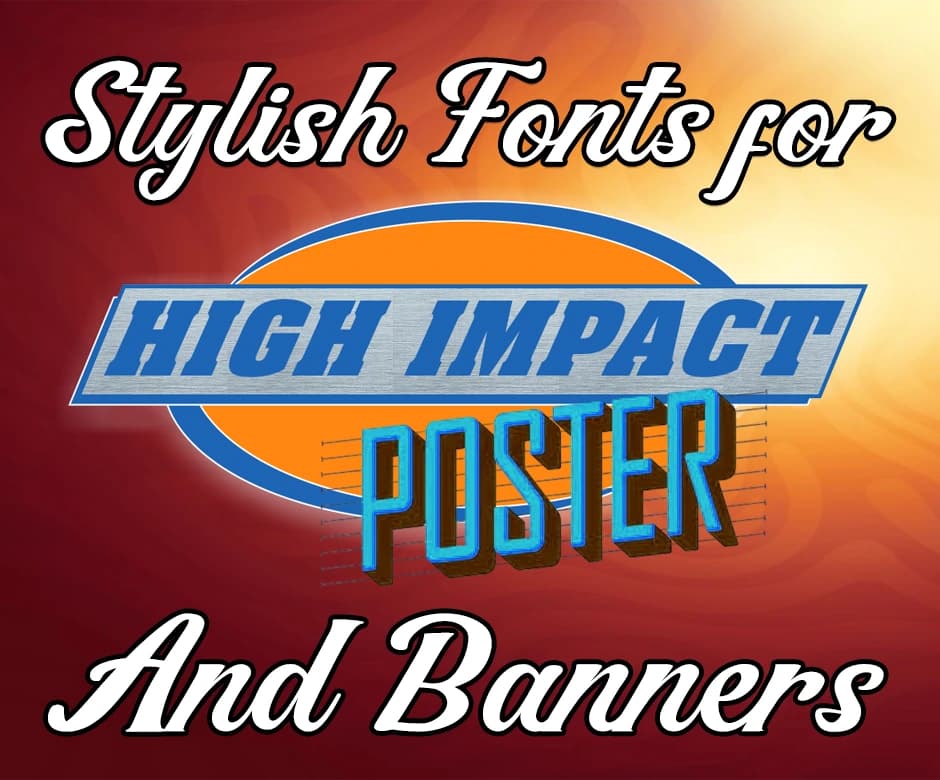
Stylish Fonts for Impactful Posters and Banner Design Tips
Typography plays a powerful role in capturing attention and shaping how your message is perceived, especially in posters and banners. Stylish fonts can instantly elevate a design, making it more memorable, engaging, and visually impactful.
Whether you're creating promotional materials, event announcements, or eye-catching displays, choosing the right typeface helps convey the right mood and highlight key information.
In this guide, you’ll learn how to use stylish fonts effectively to enhance readability, reinforce your message, and create high-impact visuals that stand out from the crowd.
What are Stylish Fonts and Why Are They Important?
Stylish fonts are typefaces designed with distinctive shapes, creative details, or modern aesthetics that help your message stand out. Unlike standard fonts used for everyday text, stylish fonts add personality and visual flair, making them ideal for headlines, posters, and promotional materials.
They are important because they influence how viewers interpret your design. A bold, dramatic font can create excitement, while a sleek, minimal font conveys professionalism.
When used correctly, stylish fonts enhance readability, establish tone, and draw attention to essential information, making your poster or banner more effective and visually appealing.
How to Use Stylish Fonts for Impactful Posters and Banners?
The following points explain how to use stylish fonts for impactful posters and banners:
1. Choose Fonts That Match Your Message
Every font has a personality. Cursive text, generated with Cursive Generator, works well for elegant or creative themes, while bold sans-serif fonts are ideal for modern, professional messages. Match the style of your font to the tone you want to communicate.
2. Prioritize Readability from a Distance
Posters and banners must be readable quickly. Use large, clear fonts for headlines and avoid overly complex typefaces for essential details. Ensure adequate spacing between letters and lines to improve clarity.
3. Use Strong Font Pairings
Combine a stylish headline font with simpler supporting fonts. A glitchy typeface, generated with Glitch Text Generator, can attract attention, while a clean sans-serif makes body text easy to read.
Limit yourself to two or three font styles to maintain visual harmony.
4. Apply Color and Contrast Strategically
High contrast between text and background ensures your message stands out. Dark text on a light background, or vice versa, boosts legibility. Use accent colors sparingly to highlight important words or offers without creating clutter.
5. Maintain Visual Hierarchy
Use different font sizes and weights to guide the viewer’s eye. A large, bold headline draws attention first, followed by medium subheadings and smaller details. This hierarchy helps communicate your message quickly and effectively.
6. Test the Design at Actual Size
Before finalizing your poster or banner, view it at full scale. This helps you confirm whether the fonts remain readable from a distance and whether the overall design feels balanced and impactful.
Generating Stylish Fonts with Text to Font:
Text to Font has made it a lot easier to generate stylish fonts. This platform offers a bunch of different tools, including Fire Text Generator, to help people create eye-catching and unique text styles without needing design skills.
The usage method of this platform is very simple. All you need to do is input your plain text, and it will instantly transform it into different stylized versions.
Pro Tips for Creating Stylish Fonts for Posters & Banners:
Creating stylish fonts isn’t just about choosing a fancy typeface. It’s about making sure your design communicates clearly while still looking visually appealing.
When used thoughtfully, stylish fonts can bring energy, personality, and impact to your posters and banners.
Here are a few expert tips to help you get the best results:
- Use no more than two or three fonts to maintain a clean, cohesive design.
- Keep the headline bold and attention-grabbing, while using simpler fonts for supporting text.
- Ensure high contrast between your text and background for easy readability.
- Prioritize font size and spacing, especially for outdoor or large-format banners.
- Choose fonts that match your message, such as playful styles for events or sleek fonts for professional promotions.
Conclusion:
Stylish fonts can transform ordinary posters and banners into powerful visual tools that grab attention and communicate your message effectively. By choosing the right font styles, pairing them thoughtfully, and prioritizing readability, you ensure your design remains both attractive and functional.
Text to Font makes experimenting with creative typography even easier, allowing anyone to produce unique text styles in seconds. With the tips and techniques covered in this guide, you’ll be well-equipped to create high-impact visuals that stand out in any setting.
Frequently Asked Questions (FAQs):
1. What makes a font “stylish”?
A stylish font has unique design features, creative shapes, or decorative elements that make it stand out. These fonts add personality and help capture attention in posters and banners.
2. How many fonts should I use in one poster?
It’s best to use two or three fonts to keep your design clean and readable. Too many fonts can make the layout look messy and confusing.
3. Are stylish fonts always readable?
Not always. Some decorative fonts can be hard to read, especially at smaller sizes. That’s why it’s important to reserve them for headlines and use simpler fonts for body text.
4. What colors work best with stylish fonts?
High-contrast color combinations, like black on white or white on dark backgrounds, work best for readability. Always ensure your text stands out clearly from the background.
5. Can I use Text to Font for professional designs?
Yes, Text to Font generates a variety of stylized text designs suitable for personal and professional projects. Just choose a style that matches your brand and keeps your message clear.

Admin
Admin is a professional and creative specializing in the latest stylish font styles for social media and brand promotion. With a passion for modern typography and digital trends, Admin helps users create eye-catching text that stands out online.