Content
- What Typography Actually Means in a Branding Context
- Why Typography Is a Trust Signal, Not a Style Choice
- The Business Outcomes Typography Actually Drives
- Serif, Sans-Serif, Script, and Display Fonts: What Each One Communicates
- Where Stylish and Decorative Fonts Fit In
- Get the Right Stylish Fonts for Your Business with Text to Font
- How to Choose the Right Typography for Your Brand
- Common Typography Mistakes That Undermine a Brand
- Conclusion
- FAQs
Business Case for Stylish Fonts: Why Typography Is a Branding Essential
Most business owners spend weeks choosing a logo color and five minutes choosing a font. That imbalance costs more than people realize. Typography shapes how fast a brand is recognized, how trustworthy it feels, and how likely someone is to actually read what a business has to say.
It is not a finishing touch. It is a business decision with measurable outcomes.
This article breaks down why typography deserves real attention, what the psychology behind it actually says, and how any brand, regardless of budget, can use font choices strategically instead of accidentally.
What Typography Actually Means in a Branding Context
Typography is often mistaken for "picking a font." In reality, it is a system. It includes the font family, the sizing hierarchy, the spacing, how headlines pair with body text, and how consistently all of that is applied across every touchpoint.
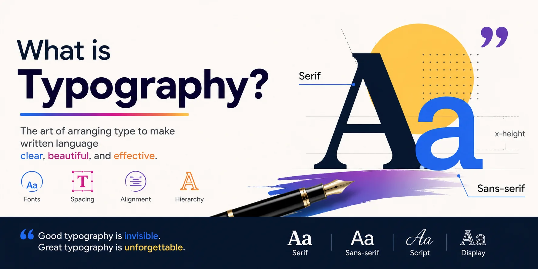
A brand's typography shows up in more places than most people account for: the logo, the website, social captions, packaging, email banners, and even in-app text. Every one of these moments either reinforces the brand or quietly works against it.
Why Typography Is a Trust Signal, Not a Style Choice
People form judgments about a brand within milliseconds, often before they consciously register what they read. Typography is a large part of that first impression, working alongside color and layout to signal whether a brand feels credible, careless, playful, or serious.
The Science Behind Font Perception
Letterforms carry psychological weight. Rounded, open shapes tend to feel approachable. Sharp, angular shapes can feel more technical or aggressive. Fonts that are easier to read also create a measurable trust effect: research on font readability shows that easier-to-read typefaces can increase reader trust by up to 40%, since the brain associates fluency with credibility.
Font-brand congruence matters too. Research from Doyle and Bottomley found that when a typeface's personality matches a brand's personality, consumers respond more favorably. Mismatch the two, and people sense something is "off" even if they cannot say why.
What Happens When Typography Is Inconsistent or Generic
Inconsistent typography forces a brand to reintroduce itself every time a customer encounters it. A website in one font, packaging in another, and social captions in a generic system font all send a subtle signal that the brand is unorganized.
This has a real cost. Consistent brand presentation across platforms has been linked to a revenue increase of up to 23%, largely because consistency reduces the mental effort a customer needs to recognize and trust a brand. Generic or mismatched typography works against that compounding effect from day one.
The Business Outcomes Typography Actually Drives
Typography is not just a design preference. It connects directly to outcomes that matter to a business.
Recognition and recall.
Consistent typography builds a visual pattern people associate with a brand over time, the same way they recognize a logo or a color palette.
Perceived credibility.
Clean, well-applied typography signals that a business pays attention to detail, which customers unconsciously extend to product quality and service.
Emotional connection.
Fonts carry personality. A script typeface feels personal and warm. A geometric sans-serif feels modern and efficient. The right choice helps a brand feel aligned with its audience instead of generic.
Conversion and on-page behavior.
Font psychology and consumer behavior research suggests that appropriate font choices can increase conversion rates by as much as 35%, since legible, well-matched typography keeps people reading instead of bouncing.
Serif, Sans-Serif, Script, and Display Fonts: What Each One Communicates
Different font categories carry different associations, and choosing the wrong one for a brand's context creates friction.
Font Style
Perceived Personality
Best-Fit For
Serif
Traditional, trustworthy, established
Law firms, finance, editorial (e.g. Coca-Cola, luxury fashion houses)
Sans-serif
Modern, clean, efficient
Tech, startups, SaaS (e.g. most Fortune 500 logos)
Script
Personal, warm, expressive
Boutique brands, artisanal products (e.g. handwritten packaging labels)
Display / decorative
Bold, distinctive, memorable
Creative brands, social-first businesses (e.g. headlines, campaign graphics)
The goal is not to pick the "best" style. It is to pick the style that matches how the brand wants to be perceived.
Where Stylish and Decorative Fonts Fit In
Most discussions about brand typography stop at serif versus sans-serif. That misses a growing part of how brands actually communicate today.
Why Brands Are Leaning Into Expressive Typography
Social feeds, product cards, and short-form content are crowded. A brand using the same default system font as everyone else has a harder time standing out in a scroll.
Stylish or decorative typography gives a brand a way to inject personality into small, high-visibility moments without redesigning an entire identity.
Stylish Fonts for Digital-First Touchpoints
This is where expressive typography earns its place: social bios, captions, product headers, promotional graphics, and other spaces where a brand needs personality quickly. A business does not need a full rebrand to test how a distinctive typographic style affects engagement in these smaller, lower-risk formats.
The Readability Trade-Off
Decorative fonts are not free of risk. Highly stylized letterforms can hurt legibility, especially at small sizes or on mobile screens. A font that looks striking in a headline can become unreadable in a caption or a product description.
The practical rule is to reserve stylish fonts for short, attention-grabbing text, and keep body copy in a clean, highly legible typeface. Style should support communication, not compete with it.
Get the Right Stylish Fonts for Your Business with Text to Font
Knowing that stylish typography can strengthen a brand is one thing. Actually creating it is usually where small businesses get stuck, since most decorative or display fonts require design software, licensing, or a designer on hand.
Text to Font removes that barrier. It is a text generator that lets any business type a simple sentence and instantly turn it into stylish, eye-catching text, without needing design skills or paid tools.
A few reasons it fits naturally into the typography practices covered in this article:
Free and instant. There is no cost or sign-up required to generate stylish text.
Wide variety of styles. Businesses can choose from bold, elegant, playful, or decorative font styles depending on the personality they want to convey.
No design skills needed. The tool does the styling automatically, so business owners do not need to understand font pairing or design software to get a polished result.
Useful across digital touchpoints. Generated text works well for social media bios, captions, product headers, and promotional graphics, which are exactly the high-visibility, lower-risk spaces where expressive typography earns its place.
For businesses that want to apply the ideas in this article without hiring a designer, Text to Font offers a simple way to start experimenting with stylish typography in minutes.
How to Choose the Right Typography for Your Brand
Choosing typography well does not require a design team. It requires a clear process.
Define the brand personality first. Typography should follow brand strategy, not lead it.
Limit the system to one or two font families. More than that creates visual noise instead of hierarchy.
Test fonts at actual usage sizes. A font that looks great at 60px may fail completely at 12px on mobile.
Check contrast and accessibility. Legibility should never be sacrificed for style, especially in body text.
Apply the choice consistently. The same fonts should show up on the website, social channels, packaging, and marketing materials.
Etsy is a useful example here. Its logo and brand typography lean into a distinctive, slightly playful style, but the site's actual product and body text stays clean and highly readable. The personality lives in the right places, not everywhere at once.
Common Typography Mistakes That Undermine a Brand
Using a typeface that does not match the brand's audience or industry
Running three or more competing font families across different channels
Ignoring how a font scales on mobile devices
Choosing style over legibility in body copy
Applying fonts inconsistently across the website, social media, and print materials
Most of these mistakes are not about bad taste. They come from treating typography as an afterthought instead of a decision worth planning.
Conclusion
Typography is one of the most accessible and highest-leverage investments a brand can make. It shapes trust, recognition, and how customers emotionally connect with a business, often before a single word is read.
Getting it right does not require a big budget. It requires intention, consistency, and knowing when style should lead and when it should simply support clear communication.
FAQs
Does font choice really affect how customers trust a brand?
Yes. Research shows that legible, well-matched fonts can increase reader trust by up to 40%, since easier reading creates a stronger sense of credibility.
What is the difference between a brand font and a stylish or display font?
A brand font is the core typeface used consistently across a business, while a stylish or display font is typically used for accents, headlines, or short-form content to add personality.
Can small businesses use decorative fonts without hurting readability?
Yes, as long as decorative fonts are reserved for short text like headlines or captions, while body copy stays in a clean, highly legible typeface.
How many fonts should a brand use?
Most brands should limit themselves to one or two font families to maintain a clear hierarchy and avoid visual clutter.
How often should a brand revisit its typography choices?
It is worth reviewing typography every 6 to 12 months, especially as a brand evolves or expands to new platforms.

TextToFont Editorial Team
The TextToFont Editorial Team publishes practical guides, tutorials, contributed and partner content covering typography, font generators, Unicode text styles, digital design, creative software, and emerging technology. Each article is reviewed for relevance, accuracy, clarity, and usefulness before publication on TextToFont.