Content
- Tip 1: Define a Consistent Brand Voice Before You Write Anything
- Tip 2: Prioritize a Clear Text Hierarchy Across the Box
- Tip 3: Choose Fonts That Reflect Your Brand Personality
- Tip 4: Write Purposeful, Benefit-Driven Messaging
- Tip 5: Keep Text Minimal to Avoid Clutter
- Common Text Mistakes That Weaken Pillow Box Branding
- Final Thoughts
- Frequently Asked Questions
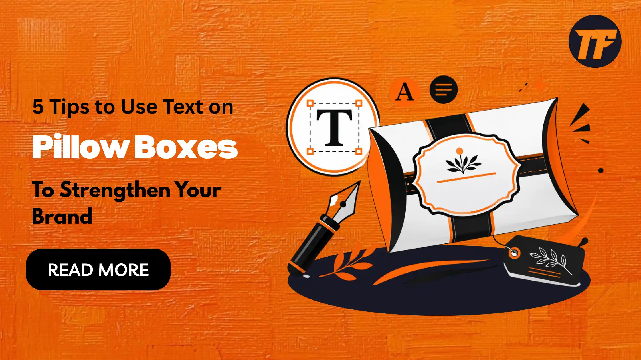
5 Tips to Use Text on Pillow Boxes to Strengthen Your Brand
Pillow boxes give your brand a small but powerful stage. Their curved shape and clean surface catch attention on shelves and in unboxing videos, but the shape alone does not build recognition.
The words printed on the box do most of that work. A well-placed logo, a clear tagline, or a simple thank-you note can turn a plain package into a branded experience customers remember.
This article covers five practical tips for using text on pillow boxes to strengthen your brand, along with common mistakes to avoid and answers to frequently asked questions.
Tip 1: Define a Consistent Brand Voice Before You Write Anything
Before deciding what text goes on your custom pillow boxes, decide how your brand sounds. A skincare brand might use a calm, minimal tone. A children's gift brand might use something playful.
A gourmet food brand might lean warm and descriptive. This voice should match what customers already see on your website and social channels.
Match Tone to Your Product Category
Luxury or premium products: formal, refined language
Everyday or casual products: friendly, conversational language
Eco-conscious products: honest, straightforward language
Keep Language Consistent Across Touchpoints
If your website copy is playful but your packaging text sounds corporate, customers notice the mismatch. Keep phrasing, word choice, and even punctuation style aligned across every place your brand appears.
Tip 2: Prioritize a Clear Text Hierarchy Across the Box
Not all text on a pillow box carries equal weight. Some information needs to be seen first. When designing custom packaging boxes, decide which text deserves the most attention and where it should appear. This hierarchy keeps the design from feeling cluttered.
Front Panel: Brand Name, Logo, and Tagline
This is the first thing a customer sees, so keep it short. A logo, brand name, and a short tagline are usually enough.
Side or Back Panel: Product Details
Ingredients, usage instructions, or certifications belong here. This is where customers look when they want more information, not when they first glance at the product.
Interior Flap: Personal Touches
A short thank-you message, a discount code, or a small note works well on the inside flap. It surprises the customer at the moment they open the box.
Tip 3: Choose Fonts That Reflect Your Brand Personality
Font choice affects both readability and perception. A script font might feel handmade and personal, while a clean sans-serif feels modern and efficient. Since pillow boxes have curved surfaces and limited space, legibility matters just as much as style.
Serif fonts feel premium and trustworthy, making them a good fit for high-end gifts or cosmetics
Sans-serif fonts feel modern and clean, suiting tech accessories or minimalist brands
Script fonts feel personal and artisanal, working well for handmade goods or boutique gifts
Stick to one or two fonts per box. Use the same pairing across your entire product line so packaging looks consistent no matter which product a customer buys.
Tip 4: Write Purposeful, Benefit-Driven Messaging
A logo alone does not tell customers why they should care about your brand. Purposeful text does more than decorate the box. It communicates value.
Write a Tagline That Says Something
Instead of a generic phrase, write a line that reflects what your brand actually offers. A tagline like "Made for everyday comfort" tells the customer something a plain brand name does not.
Use Trust-Building Text
Certifications such as "FSC Certified" or "Cruelty-Free"
Sustainability claims such as "100% Recyclable"
Simple care instructions where relevant
These small lines build credibility without adding visual clutter.
Add Storytelling for Gifts and Events
If the box is used for gifting or events, a short personal line can make the packaging feel more memorable. Even a single sentence about the occasion adds warmth without overcrowding the design.
Tip 5: Keep Text Minimal to Avoid Clutter
Pillow boxes are known for their clean, simple look. Too much text works against that. A packed panel makes the box feel busy and can actually lower how premium the product feels.
Keep each panel to a few short lines. Let white space carry part of the design. A box with room to breathe often communicates quality more effectively than one filled with information.
Common Text Mistakes That Weaken Pillow Box Branding
Using different tones of voice on the box compared to your website or social media
Cramming too much information onto a single panel
Choosing decorative fonts that are hard to read at small sizes
Writing a generic tagline that could belong to any brand
Skipping hierarchy, so customers cannot tell what to read first
Avoiding these mistakes keeps the packaging text working with your brand instead of against it.
Final Thoughts
The text on a pillow box is not just decoration. It shapes how customers perceive your brand before they even open the package. A consistent voice, clear hierarchy, readable fonts, and purposeful messaging turn a simple box into a branding tool.
Keep the text minimal, intentional, and aligned with your brand everywhere else, and the packaging will do more than hold a product. It will represent your brand well.
Frequently Asked Questions
What should you always include in the text on a pillow box?
At minimum, include your brand name or logo and a short tagline. These two elements give customers instant recognition even with limited space.
How much text is too much for pillow box packaging?
If a panel needs more than a few short lines to read comfortably, it is likely too much. Keep essential details on secondary panels rather than the front.
Does font choice really affect brand perception?
Yes, fonts influence how customers perceive quality and personality before they read a single word. A mismatched font can make even good copy feel off-brand.
Can pillow box text be used for storytelling, not just branding?
Yes, a short message on the interior flap or back panel can add warmth, especially for gifts or special occasions. It turns a functional box into part of the customer experience.
Should pillow box text match the brand's website and social media tone?
Yes, consistency across every touchpoint helps customers recognize your brand instantly. A mismatch in tone can make the packaging feel disconnected from the rest of the brand.

Admin
Admin is a professional and creative specializing in the latest stylish font styles for social media and brand promotion. With a passion for modern typography and digital trends, Admin helps users create eye-catching text that stands out online.