Content
- Start With the Most Important Information
- Use Italic Text for a Tagline
- Give Creator Bios a Distinctive Voice
- Make Gaming Profiles More Personal
- Use Italic Text for Professional Positioning
- Separate Secondary Profile Details
- Use It Selectively in Captions
- Keep Essential Information Simple
- Italic vs. Bold: Which One Fits a Profile?
- Common Mistakes With Italic Profile Text
- Final Takeaway
- Frequently Asked Questions (FAQs)
How to Use Italic Text in Social Media Profiles
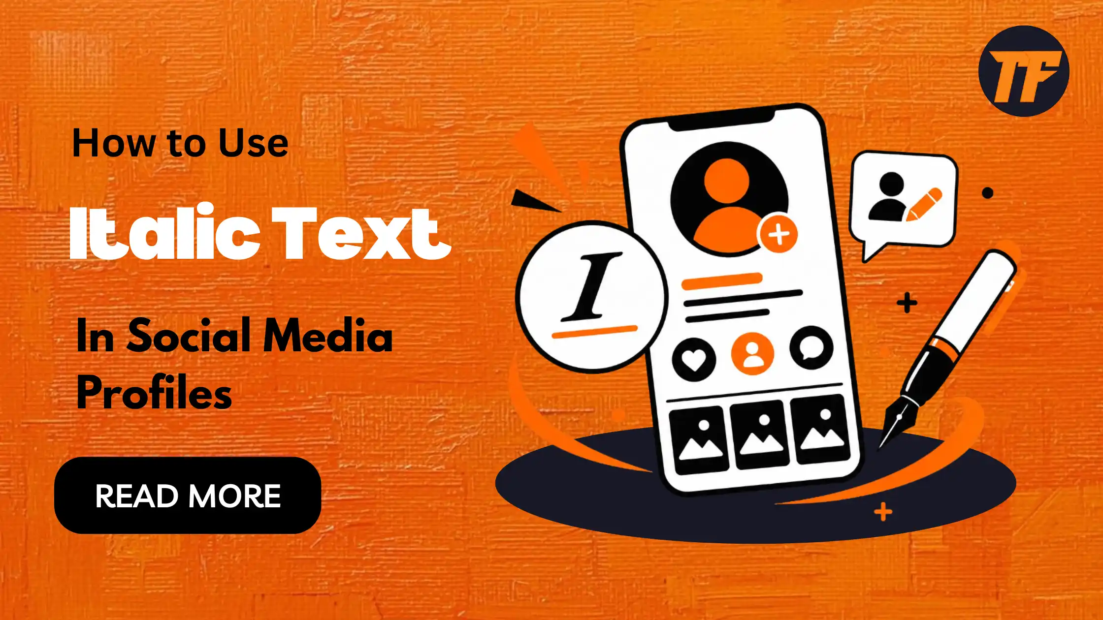
A social media profile gives you only a few lines to show people who you are, what you do, and what they can expect from your content. When every line looks the same, even a well-written bio can feel flat. A small typography change can help create hierarchy without adding another graphic or emoji.
Italic text is particularly useful for short taglines, secondary descriptions, creator statements, and profile details that should look different from the main identity. TextToFont's Italic Text Generator makes this practical by converting regular text into copy-and-paste italic styles that can be used on supported social platforms.
The key is not to italicize everything. Use the style where it adds meaning or visual separation, then keep the rest of the profile straightforward.
Start With the Most Important Information
Before choosing an italic style, consider the role of each piece of information in your profile. The main identity should be easy to notice first, while supporting details can use lighter styling. This creates a clear reading order.
A typical profile may contain:
A name or brand
A profession or niche
A short description
A tagline
Supporting details
A call to action
Italic text usually works better for the supporting information than the main identity.
For example:
Digital Marketing Specialist
SEO, content and online growth
Helping businesses improve their search visibility
Here, the first line establishes the identity. The italic line adds context without competing with it.
That simple hierarchy is more useful than applying a decorative style to every line.
Use Italic Text for a Tagline
Taglines often explain what a person, brand, or account offers in just a few words. Italic text can help separate this statement from the name or main heading, making the tagline feel like supporting information rather than another primary element.
Consider:
Tech Media Platform
Technology explained without the jargon
The second line has a different role from the first, so giving it a different visual treatment makes sense.
This approach can work for personal brands, businesses, publications, creators, and communities. You do not need an elaborate font combination; a short italic phrase can provide enough contrast on its own.
Give Creator Bios a Distinctive Voice
Creator profiles often need to communicate both what someone does and what makes their content worth following. A short italic statement can add personality, explain their approach, or describe their content focus without making the bio feel crowded or overly promotional.
For example:
Alex | Content Creator
Making complicated tech easier to understand
The first line tells visitors who the person is. The second gives them a reason to understand the account.
Italic styling works well here because the statement feels like supporting context rather than another heading.
Make Gaming Profiles More Personal
Gaming profiles often have more freedom for expressive language and informal descriptions. An italic phrase can highlight a player's preferred game, competitive focus, personality, or gaming mindset. It adds character to the profile while keeping the username or gamer tag visually prominent.
For example:
NOVA_Rex
Competitive FPS player
Or:
ShadowByte
Ranked grind never stops
The italic phrase adds character while leaving the username easy to recognize.
This can work across gaming profiles, community pages, Discord descriptions, and other places where users have a small amount of customizable text.
Use Italic Text for Professional Positioning
Professional profiles should communicate their purpose quickly and clearly. An italic phrase can support the main business name by explaining its service, audience, or value without making the profile look overly decorative. The goal is distinction, not excessive visual emphasis.
For example:
Web Development Studio
Websites for growing businesses
Design • Development • Support
The company or service remains the primary information, while the italic phrase communicates positioning.
This is where typography should remain understated. A professional profile generally does not need several decorative styles competing with the business name, services, and contact information.
Separate Secondary Profile Details
Not every profile detail needs the same level of attention. Locations, specialties, availability, or short descriptions can appear in italic text to distinguish them from the primary identity. This creates a simple hierarchy that helps visitors understand the profile at a glance.
For example:
Photography Studio
London • Portraits • Events
Bookings open for 2026
The location and specialties can use an italic treatment while the business name and booking information remain clear.
This structure can also work for travel creators, newsletters, online communities, consultants, and personal brands.
The principle is simple: use styling to show the relationship between pieces of information.
Use It Selectively in Captions
Italic text can also add structure to social media captions when used for short phrases rather than entire posts. It can highlight an introduction, thought, or transition before the main message, giving readers a clear visual starting point without overwhelming the caption.
A short italic phrase can introduce a caption or provide a transition before the main message:
A quick lesson from this week's project:
The rest of the caption can remain in regular text.
This gives readers a visual entry point without turning the entire post into stylized characters. For longer captions, keeping most of the text standard is usually the more readable approach.
Keep Essential Information Simple
A stylish profile still needs to be understandable.
Names, contact information, important instructions, website addresses, and other essential details should generally remain easy to read. Unicode characters can also render differently depending on the platform, device, or font support.
If an unusual style makes someone work harder to understand your message, it is probably doing too much.
A useful rule is to ask: Does this styling improve the way the information is understood, or does it only make it look different?
If the answer is only the latter, standard text may be the better choice.
Italic vs. Bold: Which One Fits a Profile?
Bold and italic serve different visual purposes.
Bold tends to create stronger emphasis and is useful when something needs to stand out immediately. Italic creates a softer distinction and is often better suited to supporting information or subtle emphasis.
For example:
Web Designer
Creating clean websites for small businesses
The bold line establishes the main identity, while the italic line provides additional context.
If you want to understand the broader difference between the two styles and when each is appropriate, see Bold vs. Italic: Key Difference and Uses.
Common Mistakes With Italic Profile Text
Italic styling can lose its usefulness when it becomes the default treatment for everything.
Avoid these common problems:
Making the entire bio italic
Mixing several decorative Unicode styles without a reason
Styling important information that needs to be immediately readable
Using long blocks of unusual characters
Choosing a style without checking its appearance on mobile
Changing styles repeatedly across similar profile elements
Consistency usually produces a cleaner result than variety.
If a profile has one clear identity, one supporting styled phrase, and straightforward information underneath, visitors can understand it quickly without feeling that the typography is competing for attention.
Final Takeaway
Italic text works best when it has a clear purpose. Use it to separate a tagline from a profile name, add personality to a creator description, distinguish a gaming phrase, or give secondary information a different visual role.
The strongest profiles do not rely on typography alone. They make the identity clear first, then use styling selectively to guide attention.
For copy-and-paste italic styles, TextToFont provides a simple starting point. Choose a style that remains readable, test it on the platform where you plan to use it, and let the typography support the message rather than become the message itself.
Frequently Asked Questions (FAQs)
Can I use italic text in a social media bio?
Yes. Copy-and-paste Unicode italic text can be used in supported social media fields. It works particularly well for short taglines, descriptions, and secondary profile information.
What should I italicize in my bio?
A short tagline, creator statement, niche description, or secondary detail is usually a better choice than your entire bio.
Does Unicode italic work on every platform?
Not necessarily. Support and appearance can vary between platforms and devices. Always check the final text after pasting it into your profile.
Is italic text better than bold text for a social profile?
Neither is universally better. Bold creates stronger emphasis, while italic provides a softer distinction. The better choice depends on what you want the reader to notice.
Can I use italic text in social media captions?
Yes, where the platform accepts the relevant Unicode characters. Short phrases or introductory lines are generally more practical than styling an entire caption.

Admin
Admin is a professional and creative specializing in the latest stylish font styles for social media and brand promotion. With a passion for modern typography and digital trends, Admin helps users create eye-catching text that stands out online.