Content
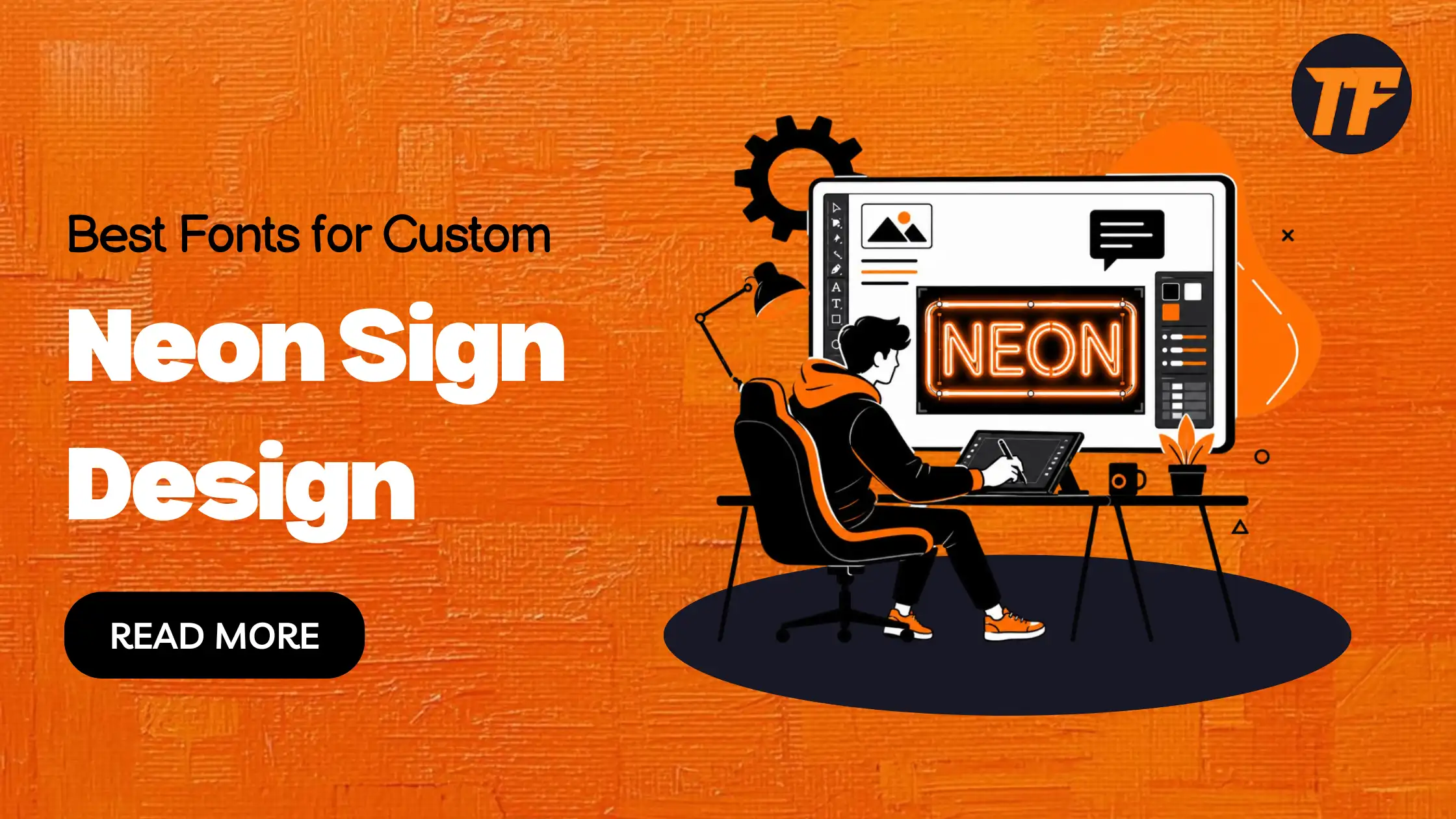
Best Fonts for Custom Neon Sign Design
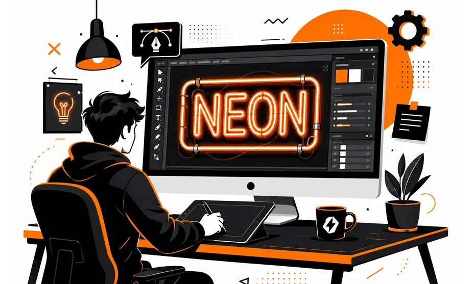
Have you ever looked at a blank sign template, wondering why some neon designs just pop while others fall flat? Turns out, it's not always about the colors or the glow. Font choice makes a huge difference in how your sign turns out once it's lit up.
Some typefaces bend perfectly into smooth neon curves, while others get lost or look messy once they're glowing on the wall.
If you're planning a custom neon sign for your shop, café, or even your bedroom wall, picking the right font is step one. Let's break down what actually works.
Why Font Choice Matters in Neon Sign Design
Unlike printed graphics, neon signs must be physically constructed using curved glass tubes or flexible LED strips. This production process creates limitations that affect how certain fonts appear once illuminated.
A well-planned Font choice influences several critical factors:
Readability from various distances
Brand recognition and customer perception
Manufacturing feasibility
Visual impact in indoor and outdoor environments
Long-term sign effectiveness
Research in visual communication consistently shows that typography affects how people perceive brands. A clear, well-balanced typeface helps businesses communicate professionalism, creativity, or sophistication depending on their goals.
Many sign manufacturers, including Voodoo Neon, recommend font styles that have proven successful across thousands of neon installations because they balance aesthetics with practical production requirements.
Best Font Categories for Neon Signs
Not every font works equally well when transformed into illuminated signage. The following font categories consistently perform well in neon applications.
1. Script Fonts
Script fonts remain one of the most recognizable styles in neon design.
Their flowing, connected letterforms naturally follow the curves required in neon tubing, creating a smooth and elegant appearance. Script typography often evokes nostalgia while maintaining visual appeal in modern settings.
Best suited for:
Cafés
Bars
Beauty salons
Wedding décor
Boutique stores
Key advantages:
Smooth continuous strokes
Strong visual personality
Excellent for decorative signage
2. Bold Sans-Serif Fonts
Sans-serif fonts are among the most practical options for commercial signage.
Their clean structure and thicker letterforms improve visibility from a distance while minimizing production challenges. Businesses seeking a modern and professional appearance often prefer this category.
Best suited for:
Retail stores
Fitness centers
Technology companies
Restaurants
Corporate environments
Benefits include:
High readability
Clean modern appearance
Consistent illumination
3. Retro and Vintage Fonts
Vintage-inspired typography continues to influence contemporary signage trends.
These fonts combine bold strokes with distinctive character, making them ideal for brands seeking a nostalgic atmosphere. When carefully selected, retro fonts can create memorable focal points without sacrificing readability.
Popular applications include:
Diner-style restaurants
Barbershops
Themed venues
Entertainment businesses
4. Monoline Fonts
Monoline fonts feature consistent stroke widths throughout every letter.
Because neon tubing typically maintains a uniform width, monoline typefaces translate exceptionally well into illuminated signage. The result is a clean and balanced visual presentation.
Ideal for:
Minimalist branding
Contemporary logos
Interior décor signage
Creative studios
Advantages:
Simplified production
Balanced appearance
Excellent legibility
5. Brush and Handwritten Fonts
Brush-inspired typography creates a personalized and artistic look.
When designed with sufficiently thick strokes, these fonts can produce eye-catching neon signs that feel authentic and approachable. They are particularly effective for businesses that want to emphasize creativity and individuality.
Common uses include:
Coffee shops
Artisan brands
Beauty studios
Creative agencies
6. Display Fonts
Display fonts are designed to make a strong visual statement.
Their distinctive letterforms attract immediate attention and work particularly well when displaying short words, slogans, or business names. However, they should be used carefully because excessive complexity can reduce readability.
Best applications:
Brand logos
Feature walls
Event signage
Single-word statements
Fonts to Avoid for Neon Signs
Certain font styles often create challenges during production or reduce overall visibility.
Traditional Serif Fonts
Small decorative terminals can appear uneven or cluttered when translated into neon tubing.
Ultra-Thin Fonts
Very thin strokes may become difficult to illuminate consistently and can reduce readability from a distance.
Condensed Fonts
Tightly spaced letters may overlap visually when illuminated, making words harder to read.
Highly Detailed Decorative Fonts
Complex details often disappear when converted into neon form, reducing the design's effectiveness.
How to Choose the Right Neon Font
When selecting a font for a custom neon sign, consider the following questions:
Does It Match Your Brand Identity?
The font should support the personality of the business, whether modern, playful, luxurious, or vintage.
Is It Readable at Different Sizes?
A font that remains clear when scaled down will generally perform better in large-format signage.
Does It Work With Neon Production?
Avoid intricate details and prioritize smooth curves and consistent stroke widths.
Have You Tested a Digital Preview?
Reviewing a mockup before manufacturing helps identify spacing, visibility, and design issues early in the process.
Final Thoughts
The success of a neon sign depends on more than color and lighting. Typography determines whether people can read, recognize, and remember the message being displayed. Script fonts, monoline styles, bold sans-serifs, retro designs, brush lettering, and carefully selected display fonts continue to dominate neon sign design because they balance aesthetics with functionality.
Before finalizing your next sign project, evaluate how the typeface performs in real-world conditions. The right Font choice can transform a simple sign into a memorable visual asset that strengthens brand recognition and attracts attention long after the lights turn on.
Frequently Asked Questions
What type of font works best for neon signs?
Script, monoline, bold sans-serif, and certain display fonts generally produce the best results because they translate effectively into illuminated signage.
Are serif fonts suitable for neon signs?
Some modern serif fonts can work, but traditional serif designs often contain small details that become difficult to reproduce accurately.
Why are thick strokes important in neon typography?
Thicker strokes improve visibility, create stronger illumination, and simplify the manufacturing process.
Can decorative fonts be used in neon signs?
Yes, but decorative fonts work best for short words or logos where readability remains a priority.

Admin
Admin is a professional and creative specializing in the latest stylish font styles for social media and brand promotion. With a passion for modern typography and digital trends, Admin helps users create eye-catching text that stands out online.