Content
How Vaporwave Typography Works in Retro Music Artwork
Vaporwave typography gives retro music artwork its distinct digital look through unusual fonts, wide lettering, pastel colors, and distorted effects. Inspired by 1980s and 1990s technology, advertising, gaming, and consumer culture, it turns ordinary text into part of the artwork itself.
From full-width Unicode characters to chrome gradients and glitch effects, each choice adds a different retro reference.
The style can also create a sense of nostalgia for an era that some viewers never experienced firsthand. Understanding how these elements work together makes it easier to recognize what gives vaporwave typography its characteristic appearance.
What Is Vaporwave Typography?
Vaporwave typography uses specific fonts, letter shapes, spacing, colors, and effects to create a retro digital look. It developed alongside the vaporwave music scene in the early 2010s, drawing from 1980s and 1990s technology, advertising, consumer culture, and Japanese design.
Common features include wide or full-width characters, pastel gradients, chrome effects, glitch distortion, pixel-style lettering, and bold neon-inspired fonts.
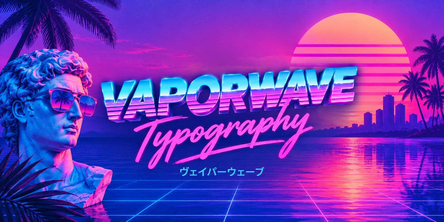
Unlike Greek busts, palm trees, and checkerboard grids, which are visual elements of the wider vaporwave aesthetic, typography focuses specifically on how the text looks and is arranged.
Vaporwave Font Examples
VAPORWAVE
𝕍𝔸ℙ𝕆ℝ𝕎𝔸𝕍𝔼
𝓥𝓐𝓟𝓞𝓡𝓦𝓐𝓥𝓔
𝙑𝘼𝙋𝙊𝙍𝙒𝘼𝙑𝙀
𝖁𝕬𝕻𝕺𝕽𝖂𝕬𝖁𝕰
ᴠᴀᴘᴏʀᴡᴀᴠᴇ
VΛPӨЯЩΛVΣ
PINK SKY
RETRO DREAM
𝙉𝙀𝙊𝙉 𝙉𝙄𝙂𝙃𝙏
Key Features of Vaporwave Typography
These are the building blocks designers reach for again and again. Most vaporwave covers combine two or three of these rather than using all of them at once.
Chrome and Gradient Text Effects
Pink-to-cyan or purple-to-blue gradients, paired with a reflective chrome finish, are probably the single most recognizable trait of the style.
The chrome look mimics the shiny plastic surfaces of 90s electronics and CD cases, while the gradient adds the pastel warmth associated with sunset skies and mall lighting.
Full-Width and Japanese-Influenced Characters
Vaporwave frequently uses full-width Latin characters or actual Japanese katakana and kanji, often without concern for grammatical accuracy.
The wider spacing slows down how the text reads, which fits the genre's unhurried, slightly overdone pacing. It also visually ties the artwork to Japanese consumer tech branding from the same era.
Glitch, Scan Lines, and VHS Distortion
Pixel glitches, RGB channel splitting, and horizontal scan lines are used to make clean digital text look like it is being viewed on an old CRT screen or a worn VHS tape. This signals degraded, aging media rather than something freshly made.
Extruded, 3D, and Isometric Lettering
Drop shadows, hard outlines, and pseudo-3D extrusion give flat text a sense of depth similar to early 3D rendering software. This technique is common in titles that need to feel physical, almost like signage rather than printed text.
Script, Pixel, and Outrun Fonts
Vaporwave typography commonly uses three font styles, each creating a different retro effect:
Script fonts create a soft, handwritten look and work well for smaller supporting text.
Pixel or bitmap fonts resemble early computer and video game lettering.
Bold outrun or neon fonts suit large titles and create a strong 80s-inspired look.
A design can use one style for the main title and another for supporting text, creating contrast while keeping the artwork readable.
How Does Vaporwave Typography Work in Retro Music Artwork?
Vaporwave typography works by making text feel like part of the retro media and consumer culture that inspired the aesthetic. Its fonts, proportions, colors, and digital effects each contribute to that impression, while their combination gives music artwork its distinctive look.
Typography Creates a Sense of Time
Vaporwave typefaces often resemble lettering from older computers, electronics, advertisements, and arcade games.
Pixel fonts like Press Start 2P recall early gaming, while geometric fonts like Orbitron suggest futuristic 80s and 90s technology.
Unicode styles can create a similar effect. For example, 𝕍𝔸ℙ𝕆ℝ𝕎𝔸𝕍𝔼 gives the title a stylized digital appearance that fits the aesthetic.
Wide Lettering Changes How the Text Feels
Vaporwave often treats the width and spacing of letters as part of the visual style. Full-width characters such as AESTHETIC make Latin text occupy more horizontal space, while increased letter spacing can produce a similar effect.
This gives short titles a stretched, spacious appearance that fits the slower, exaggerated feel of the aesthetic. It also makes the typography feel closer to Japanese-influenced technology and branding that became associated with vaporwave imagery.
Color and Surface Effects Make Text Feel Synthetic
Pastel pink, purple, cyan, and blue are common in vaporwave typography because they connect the text to the colored lighting, sunsets, screens, and consumer graphics associated with the aesthetic. Gradients make these colors flow through the letters rather than appearing as flat blocks.
Chrome, reflections, and 3D effects add another layer by making the letters look like physical surfaces or early computer-rendered objects. Together, color and surface effects can make ordinary text feel like an artifact from a fictionalized version of the 80s or 90s.
Digital Distortion Makes the Text Look Aged
Glitches, RGB separation, scan lines, noise, and VHS distortion imitate the visual problems of older screens and recorded media. Instead of presenting text as perfectly clean digital information, these effects make it appear degraded or unstable.
This is important to vaporwave because the aesthetic often plays with the contrast between modern digital creation and outdated technology. The distortion makes new artwork appear connected to older forms of media.
Different Type Styles Create Visual Hierarchy
Vaporwave music artwork often combines more than one type style, but the fonts do different jobs. A large display or geometric font can carry the album title, while a script or pixel font can handle the artist name and smaller details.
This creates hierarchy while preserving the retro character of the artwork. The typography therefore works as both information and imagery, with the main title becoming part of the visual composition rather than simply labeling the cover.
Typography Completes the Retro Music Artwork
The strongest vaporwave typography does not exist separately from the rest of the cover. Its proportions, colors, and effects interact with elements such as classical sculptures, grids, digital landscapes, Japanese characters, and other references to older consumer culture.
That relationship is what makes the typography feel distinctly vaporwave. A chrome title alone may look like generic retro design, but the same treatment placed within the right combination of imagery, spacing, and color can communicate the aesthetic much more clearly.
Common Mistakes That Break the Vaporwave Look
A few habits tend to undercut the style rather than support it:
Stacking too many effects on one word, making the text unreadable
Mixing clearly modern fonts with heavy 90s CRT effects without any intentional contrast
Ignoring contrast and legibility at small sizes, especially for streaming thumbnails
Using Japanese characters without any thought to how they read visually next to the rest of the design
Relying on a single overused font, which makes artwork blend into hundreds of similar covers
Conclusion
Vaporwave typography works by combining retro lettering with visual references to older technology, media, and consumer culture. Wide characters, unusual Unicode styles, pastel colors, chrome effects, and digital distortion each contribute to the overall look.
Their purpose is not simply to make text appear old, but to make it feel connected to a specific version of the past. When these elements work together, typography becomes an important part of the mood and identity of retro music artwork.
People Also Ask
What fonts are considered vaporwave?
Script fonts, pixel or bitmap fonts, and bold neon outrun fonts are the three main categories. Most artwork combines one dominant font with a second one used sparingly for contrast.
Why does vaporwave typography use Japanese characters?
Japanese consumer electronics and signage were a major visual reference point for early vaporwave artists. Full-width Japanese text also slows down reading pace, which fits the genre's relaxed, oversized feel.
Is vaporwave typography still relevant today?
Yes, it remains common in synthwave, retro gaming, and lo-fi music branding. It has also influenced related styles like mallsoft and future funk, which use similar lettering techniques.
What software is used to create vaporwave-style text effects?
Photoshop is the most common tool for chrome gradients, glitch effects, and extrusion work. Simpler effects can also be created through dedicated vaporwave text generators online.
What is the difference between vaporwave and synthwave typography?
Vaporwave typography leans pastel, chrome, and consumer-nostalgic, often referencing malls and early computing. Synthwave typography tends to be darker and more electric, favoring neon outlines tied to 80s action and racing imagery.

Admin
Admin is a professional and creative specializing in the latest stylish font styles for social media and brand promotion. With a passion for modern typography and digital trends, Admin helps users create eye-catching text that stands out online.