Content
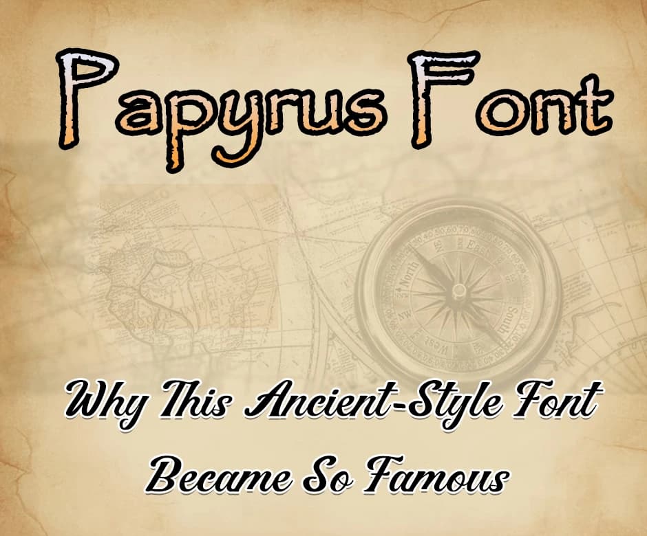
Papyrus Font: Why This Ancient-Style Font Became So Famous
Papyrus is one of the most instantly recognizable fonts in the world, known for its rough, textured strokes that evoke an ancient, historical feel. Created in 1982 by designer Chris Costello, it was inspired by calligraphy and the visual style of ancient manuscripts.
Over the decades, Papyrus has become ubiquitous, appearing in everything from restaurant menus to movie titles, earning both admiration and ridicule.
Its unique blend of historical charm and modern accessibility has cemented its place in popular culture, making it a force that is as famous as it is controversial. In this article, we will discuss why this ancient-style font became so famous. Let’s start.
Origins of the Papyrus Font:
Papyrus was designed in 1982 by Chris Costello, a calligrapher and graphic designer. Costello wanted to create a font that captured the feeling of ancient, hand-written scripts, with an organic, textured appearance that suggested age and authenticity.
Inspired by historical manuscripts and early writing techniques, Papyrus was initially intended for artistic projects and displays rather than mass media.
Its handcrafted look, combined with subtle irregularities in its letterforms, gave it a sense of timelessness and human touch.
Design Characteristics of Papyrus:
Papyrus is defined by its distinctive rough edges and irregular strokes, giving it a hand-crafted appearance. Its textured look mimics the feel of ancient writing materials, like papyrus scrolls and parchments.
The font balances readability with a decorative, almost artistic style, making it stand out from clean, modern typefaces.
Compared to other “ancient” or decorative fonts, Papyrus maintains a unique charm that feels authentic rather than purely ornamental, which contributed to its appeal across multiple design contexts.
Why Papyrus Became So Famous?
Papyrus became very famous for a number of different reasons. Here are the main ones:
Unique and Distinctive Design
One of the main reasons Papyrus became famous is its instantly recognizable aesthetic. Its textured edges, irregular strokes, and hand-crafted look set it apart from clean, modern fonts.
This distinctive style made it ideal for projects seeking an exotic, historical, or mystical vibe. Designers and businesses looking for something eye-catching and thematic naturally gravitated toward it, giving Papyrus widespread exposure.
You can also play around with this font by adding different emotions and other stylish elements.
As a person who enjoys creating unique designs or social media content, you can use Text to Font to add such stylish elements to your fonts. It is a free tool that is designed to help get different stylized fonts that you can use in your posts, graphics, or personal projects to make them more eye-catching and creative.
Accessibility Through Software
Papyrus’s fame was boosted enormously when it became widely available on major software platforms, especially Microsoft Office. Being pre-installed on millions of computers made it easy for anyone, from professional designers to casual users, to use it in their projects.
Its availability meant that Papyrus could reach a global audience quickly, increasing its use in everything from posters and menus to digital content.
Adoption in Media and Entertainment
High-profile media appearances also played a big role in its fame. Papyrus was used in movies, advertisements, and even theme park branding, where its ancient-style feel fit fantastical or historical contexts.
Notable examples include movie titles and menus in popular films. Such visibility reinforced its status, turning a niche artistic font into a widely recognized cultural icon.
Versatility and Memorability
The design of this font allows it to evoke history, mysticism, or exoticism, which makes it versatile for many different creative projects. Its rough, handcrafted texture also gives it memorability.
This is why people instantly recognize it, even after brief exposure. This combination of versatility and instant recognition helped Papyrus stick in people’s minds and contributed to its enduring fame.
Internet Culture and Memes
Ironically, some of Papyrus’s fame today comes from mockery. Internet memes, especially poking fun at its overuse and the famous Avatar menu example, kept the font in public discussion. While criticism could have harmed its reputation, it actually made Papyrus even more well-known, cementing it as a cultural reference point.
Conclusion
Papyrus became famous not just because it looks “ancient” or beautiful, but because of a combination of factors: its unique design, accessibility through software, media exposure, versatility, and even internet-driven notoriety.
Its fame demonstrates how a font can transcend its original purpose, becoming a cultural icon that is instantly recognizable and widely discussed, sometimes with admiration, sometimes with humor, but always with attention.
Frequently Asked Questions (FAQs):
1. Why is Papyrus considered an “ancient-style” font?
Papyrus has rough, textured edges and uneven strokes that mimic the look of old manuscripts. Its design evokes a hand-crafted, historical feel.
2. Why did Papyrus become so widely used?
It was pre-installed on Microsoft Office and other software, making it accessible to millions of users. Its unique, eye-catching style made it popular for many creative projects.
3. Why do designers often criticize Papyrus?
Many consider it overused and unprofessional in modern design contexts. Its distinct style can feel clichéd if not applied thoughtfully.
4. How did Papyrus gain attention in pop culture?
It appeared in movies, advertisements, and menus, most famously in the film Avatar. Internet memes also contributed to its cultural visibility.
5. Is Papyrus still used today?
Yes, but mostly for projects that want a historical or mystical aesthetic. Its iconic style keeps it recognizable, even if it’s no longer trendy in professional design.

Admin
Admin is a professional and creative specializing in the latest stylish font styles for social media and brand promotion. With a passion for modern typography and digital trends, Admin helps users create eye-catching text that stands out online.