Content
How to Control Zalgo Text Without Losing Readability
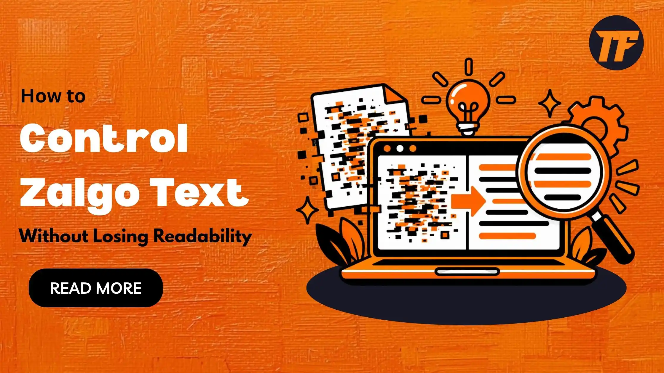
To control Zalgo text without losing readability, use only a few combining marks per letter, apply the effect to one or two key words, and keep the surrounding text clean and high-contrast. Always test on different devices, since rendering varies.
Zalgo text creates eye-catching, glitchy visuals for design, social media, and branding. But too much of it makes content unreadable and frustrates your audience.
In this article, we will explore what Zalgo text is, why readability matters, and how to use it effectively in your projects.
Quick Guide to Control Zalgo Text Without Losing Readability
Use only 1-3 combining marks per letter, not stacked heavy distortion.
Apply Zalgo to one or two key words, like a heading or brand name.
Pair it with plain, simple text around it.
Use dark text on light backgrounds (or the reverse) so letters stay visible.
Larger font sizes give the marks room and keep letters readable.
Never use Zalgo for full paragraphs or important instructions.
Check on mobile, desktop, and different browsers, as rendering varies.
What Is Zalgo Text?
Zalgo text is created by combining regular letters with multiple Unicode characters. These special characters stack above and below normal letters, creating a distorted, glitchy, or corrupted appearance. For example, the word "ZALGO" can be transformed into Z̴̡̨A̸̰̔L̶̗̈G̶̯̊O̴̰͠.
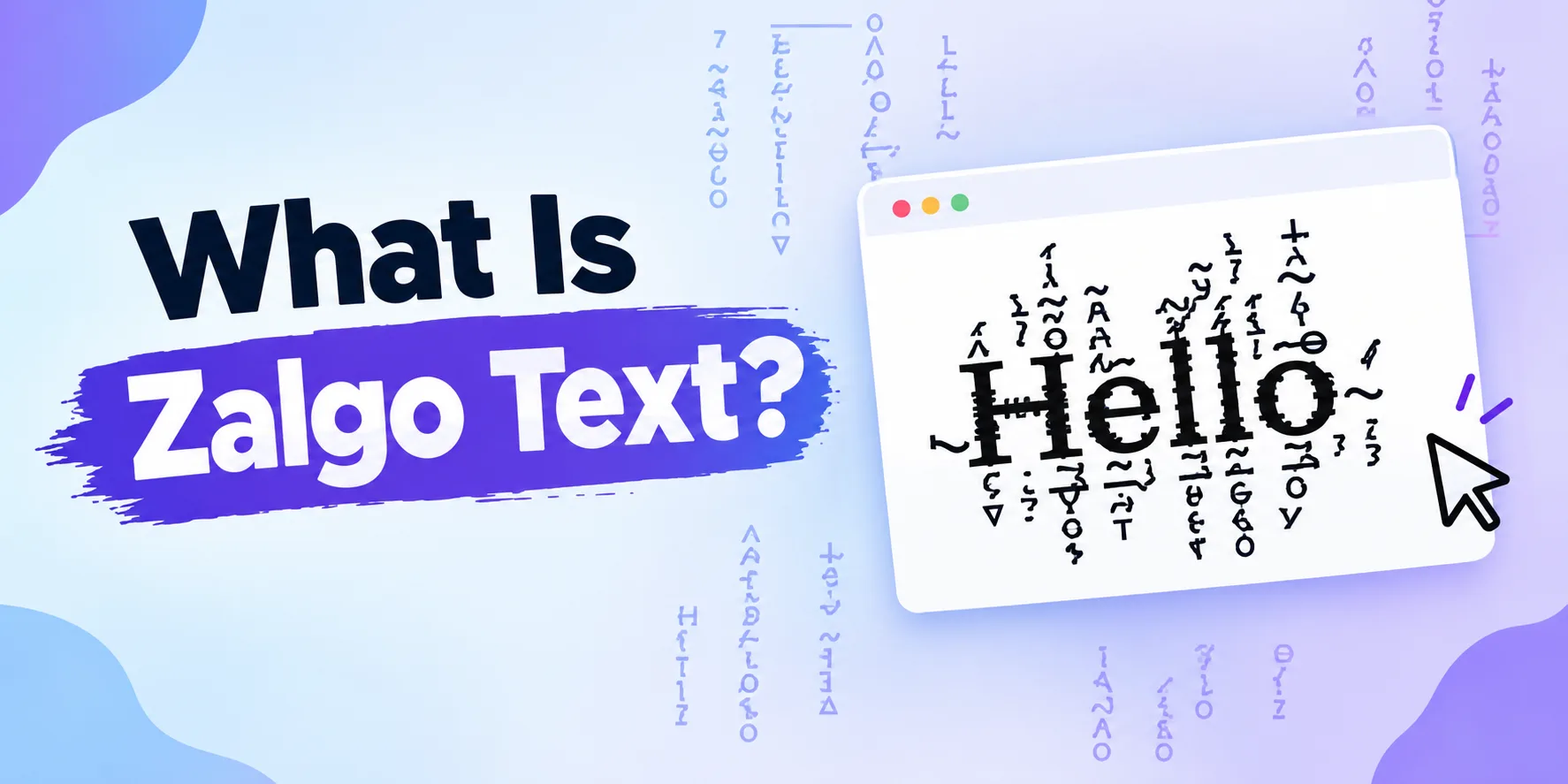
The name "Zalgo" comes from internet culture and the concept of "corrupting" text to create an eerie or chaotic aesthetic. Unlike reversed or mirrored text, Zalgo text doesn't change the letters themselves. It adds visual layers through combining diacritical marks that overlap and distort the appearance.
Why Readability Matters When Using Zalgo Text
Zalgo text can grab attention, but uncontrolled use creates several problems. Text that's too distorted becomes impossible to read, defeating the purpose of communication. Your audience may give up trying to understand the message, or they may experience eye strain from struggling with illegible content.
In professional settings, whether marketing, branding, or web design, readability is essential. Even creative projects need to balance visual appeal with functional communication. When people can't read your message, they don't engage with it. That's why controlling Zalgo text is crucial.
How to Control Zalgo Text Without Losing Readability
Use Zalgo Text Sparingly for Emphasis
Apply Zalgo text to key words or short phrases rather than entire sentences or paragraphs. This creates focal points that draw the reader's eye without overwhelming them. For example, using Z̴A̸L̶G̴O̸ to highlight a single word in a title works better than applying it to the entire heading.
When you limit Zalgo text to specific elements, readers can still process the overall message while enjoying the visual effect on emphasized words.
Combine Zalgo Text With Regular Text
Mix Zalgo and normal text in the same line or paragraph. This contrast helps readers focus on the non-distorted text while the Zalgo elements add personality and visual interest. For instance: "This is Z̶̰̈̈n̶̨̛̝o̸̡̢͝r̶̰̈m̴̰̔a̶̧̛l text with some Z̴A̸L̶G̴O̸ accents."
The regular text provides the core message while Zalgo text creates visual depth without compromising comprehension.
Adjust the Intensity of Distortion
Not all Zalgo text is equally intense. Light Zalgo uses fewer combining characters, making it more readable while still creating a distorted effect. Heavy Zalgo uses many overlapping characters and becomes increasingly difficult to read.
For most practical purposes, light to medium Zalgo text works best. This gives you the aesthetic you want without making your content inaccessible. Z̶̰a̶l̶g̶o̶ (light) is easier to read than Z̴̳̔͝a̶̰̓͠ḷ̴̈ģ̶̛̰o̶̡̰͝ (heavy).
Use Zalgo Text in Headings, Not Body
Headings can handle more visual distortion because readers expect them to stand out and typically process them differently than body text. Body copy requires clarity and smooth reading flow, which Zalgo text disrupts.
Reserve Zalgo text for titles, subheadings, callouts, or special design elements where visual impact is the priority. Keep your main content in regular text for accessibility and ease of reading.
Consider Your Audience and Platform
Different audiences have different tolerances for unusual text styling. Younger, creative audiences may appreciate heavy Zalgo effects, while professional or older audiences may find it frustrating. Similarly, social media content can handle more experimental text than formal business communication.
Test your Zalgo text with your specific audience and adjust the intensity based on feedback and engagement metrics.
Pair Zalgo Text With Clear Messaging
Even when using Zalgo text creatively, ensure your core message remains clear. Readers should be able to understand your main point even if they struggle with distorted letters. Use Zalgo as a decoration or emphasis tool, not as the primary vehicle for important information.
For example, if promoting a product, use normal text for the product name and key details, then use Z̶A̶L̶G̶O̶ text for atmospheric or creative elements that enhance—but don't replace—the main message.
Test Readability Across Devices
Zalgo text may render differently on various devices, browsers, and screen sizes. What looks perfectly readable on your desktop might be harder to process on mobile. Always preview your Zalgo text on multiple platforms before publishing.
This ensures your creative choices don't accidentally make your content inaccessible to people viewing on phones or tablets.
How to Create Zalgo Text for Your Projects
Creating Zalgo text manually is tedious and impractical, especially for multiple words.
Text to Font is a useful tool that can generate Zalgo text instantly for your designs and content.
Enter your text into the zalgo text generator.
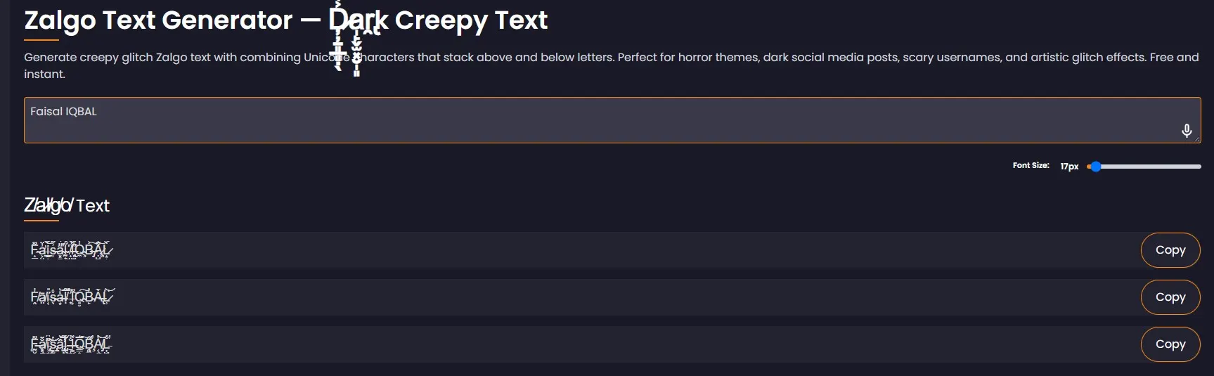
Select the intensity level (light, medium, or heavy).
Copy the result to use in your project.

This saves time and ensures consistent quality across your project.
Experiment with different intensity levels to find the perfect balance for your specific use case.
Closing Summary:
Zalgo text is a powerful creative tool when used thoughtfully. It can add visual personality to designs, make content memorable, and create unique branding elements. However, the key to success is knowing when to use it, how much distortion to apply, and how to balance it with readable text.
The difference between effective Zalgo text and frustrating distortion comes down to strategy. By using lighter intensities, limiting it to specific elements, pairing it with regular text, and prioritizing your audience's experience, you can harness the dramatic effect of corrupted letters without sacrificing communication.

Admin
Admin is a professional and creative specializing in the latest stylish font styles for social media and brand promotion. With a passion for modern typography and digital trends, Admin helps users create eye-catching text that stands out online.