Content
How Font Choice Affects a Professor's Perception of Your Paper (Reading Psychology)
Have you ever noticed how some papers just feel right as soon as you open them? That's not an accident. Before your professor even reads your first sentence, they already have a feeling about your paper, just from how it looks. The font you use, the spacing, and the size of the text all send a quiet message about how much care you put into your work.
Most people never even think about this. But studies show that fonts can make your writing seem more trustworthy or less trustworthy, even if the reader doesn't notice why. A small choice, but it makes a big difference.
First Impressions Start Before the Reading Begins
Most professors won't say this out loud. But every one of them does it anyway.
They form an opinion about a paper before reading a single word of it. Not the thesis. Not the argument. Just the look of the thing, sitting there on the desk at eleven at night.
Fonts work a bit like a handshake, honestly. Firm or limp, memorable or not, people register it instantly and rarely stop to ask why. Nobody sits there thinking "this font feels trustworthy." It just happens, somewhere below the surface, and then the reading starts.
Designers have known this for ages. What's newer is the research backing it up. Studies on reading behavior keep finding the same thing: typography nudges how credible writing looks, often before anyone's judged the actual content fairly.
When First Impressions Are on the Line
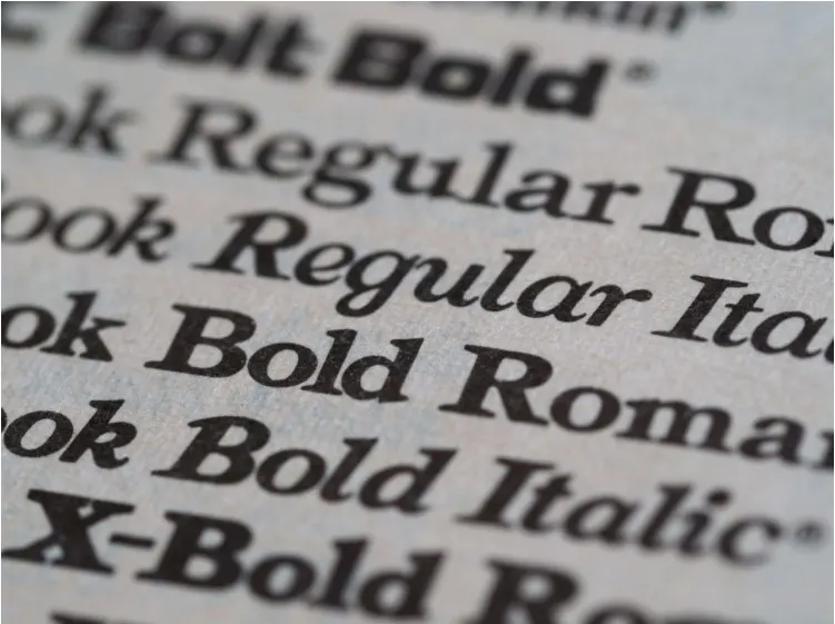
Take the Wichita State University study, led by researchers Shaikh, Chaparro, and Fox. They found readers process certain fonts faster, and they rate whatever written in them as more trustworthy. No mystery, really. Some letter forms are just easier on the eye, and that tiny head start colors how a page feels before a single real sentence gets read.
Typography slips people's minds once they're deep in ideas. Still matters, though. Mostly it comes down to seeing your own writing the way somebody outside your head would see it, something almost nobody manages solo after staring at the same paragraph for three hours straight. Plenty of writers eventually land on a thought like "maybe I should just do my essay at PapersOwl and let someone check the formatting too," which honestly isn't a bad instinct. What stands out about the work there is how consistent the quality stays across drafts, and that's the kind of thing readers respond to without ever naming it.
A second set of eyes catches spacing quirks and font mismatches that have basically gone invisible to you by that point. One small fix there sometimes beats another full round of content edits.
Get the visual side sorted, and everything else finally gets room to breathe. That's really the whole job of typography: it disappears and lets the ideas underneath do the talking. So why do some fonts pull that off better than others?
The Psychology Behind Font Perception
Fonts aren't neutral. They just feel that way from a distance, because we're around them constantly and stop noticing. Each one carries baggage: history, shape, wherever readers happen to have run into it before.
Why Serif Fonts Read as Trustworthy
Those small flourishes at the ends of letters trace back to books and newspapers, going back generations. Readers connect that lineage with authority, fairly or not. Times New Roman and Garamond sit at the center of it. Both still dominate academic and legal writing, mostly because of the seriousness baked into their history at this point.
Why Sans-Serif Fonts Read as Modern and Clean
Drop the flourishes and the whole reading experience shifts. Sans-serif fonts feel contemporary and quick to scan, likely why so many websites lean on them. Calibri, Helvetica, Arial. All approachable rather than rigid, all suited to screens and shorter writing.
Neither camp wins across the board. Comes down to setting, reader, and whatever impression a writer's actually chasing.
Here's a quick breakdown of what different font styles tend to communicate:
● Serif fonts – formal, traditional, tied to print and academic writing
● Sans-serif fonts – modern, clean, comfortable on screens
● Monospace fonts – technical, precise, common in code or data work
● Script fonts – personal, decorative, best used sparingly
● Slab serif fonts – bold and confident, strong for headings
Font Size and Spacing Shape Perception Too
A good font on its own isn't enough. Size, line spacing, and margins all pull weight too. Squeeze a great font into cramped 10-point text and most of its charm disappears, fast. Academic writing usually lands best around 11 to 12 points, with 1.5 or double spacing giving the eye somewhere to land.
Common Fonts That Work Well in Academic Settings
A short list keeps proving reliable for coursework, year after year. Not because of trends. Because research and decades of convention both point the same way.
● Times New Roman – the traditional academic default
● Calibri – softer and easier on screens
● Georgia – built specifically for on-screen reading
● Cambria – a modern serif that works in print and digital alike
● Arial – simple, neutral, almost universally accepted
Pick one of these. Attention stays where it belongs, on the writing, not whatever it's dressed in.
Simple Ways to Make Any Paper Look More Polished
A handful of small habits go further than people expect.
● Pick one font and stay consistent through the whole document
● Keep body text between 11 and 12 points
● Use 1.5 or double spacing so the page feels open, not cramped
● Save bold or italics for real emphasis, not decoration
● Leave standard margins so nothing feels boxed in
None of it takes long to fix. But it changes how a page feels the instant somebody opens it, and that first instant matters more than people give it credit for.
Final Thoughts
Typography sits quietly in the background. Shaping impressions before anyone reaches a real sentence. Choosing a clear, well-suited font sounds small, and it rarely gets much thought.
It still ends up paying off more than most people expect. The upside is that this part's genuinely easy to fix. A thoughtful font, decent spacing, a bit of structure, and ideas get the fair reading they've earned. Everything underneath, the language, the reasoning, the actual argument, tends to land harder once presentation finally gets out of the way.
FAQs:
Does font choice really affect how a professor grades a paper?
Not the grade itself directly, but it shapes the reader's first impression before they even engage with the content — research suggests easier-to-read fonts are processed faster and perceived as more trustworthy, which can color how fairly the actual argument gets judged.
What's the difference between serif and sans-serif fonts for academic writing?
Serif fonts (like Times New Roman or Garamond) carry a sense of tradition and authority from their long history in print and academic publishing, while sans-serif fonts (like Calibri or Arial) read as cleaner and more modern, especially on screens.
Which fonts are safest to use for coursework?
Times New Roman, Calibri, Georgia, Cambria, and Arial are named as reliable, low-risk choices that keep attention on the writing rather than the formatting.

TextToFont Editorial Team
The TextToFont Editorial Team publishes practical guides, tutorials, contributed and partner content covering typography, font generators, Unicode text styles, digital design, creative software, and emerging technology. Each article is reviewed for relevance, accuracy, clarity, and usefulness before publication on TextToFont.