Content
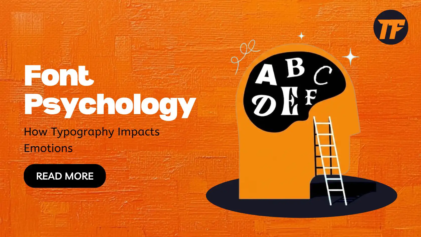
Font Psychology: How Typography Impacts Emotions
Typography is not only about selecting a font that will look good; it is about using typefaces to provoke emotions, change perceptions, and define an identity. When choosing the fonts to be used on your website, in marketing, or when branding, you realize that the choice impacts the audience's emotions. It might be helpful to be aware of font psychology to make informed design decisions that appeal to the target audience.
This article will examine the psychology behind fonts, their effects on emotions, and how they can be applied when designing content.
The Psychology Behind Fonts
Font psychology is the understanding that people are likely to react in certain ways to particular typeface designs. Typography is as important as colors and visuals in a communicative process, and it appears between the interlocutors. It is, therefore, important to emphasize the type of font that you use because it can either support your intended message or accompany it with an intended feeling.
Here are some of the main factors that influence font psychology:
Font Style: Whether the font is serif, sans-serif, script, or decorative, each style carries its emotional connotation.
Font Weight: The thickness of the characters can convey strength, softness, or delicacy.
Font Size: Larger fonts typically convey urgency or importance, while smaller fonts can feel more personal and intimate.
How Typography Affects Emotions
Different types of fonts have the quality of triggering certain emotions. Below are some of the most common types of fonts and the emotional responses they tend to trigger:
Serif Fonts: Stability and Trust

For instance, serif fonts include Times New Roman, Georgia, and Merryweather; they have small lines at the tip of the letters. Serif fonts are closely related to tradition, authority, and reliability. Serif fonts are the most commonly used in financial institutions, government organizations, and educational institutions since they provide the impression of professionalism and reliability.
Emotional Impact: Serifs make everything look professional and quality-oriented due to the professionalism, solidity, reliability, and believability they produce. They are suitable for companies that appeal to older and more mature audiences.
Sans-Serif Fonts: Clean and Modern

Sans-serif fonts, like Helvetica, Arial, and Roboto, are known for their clean and minimalist design, which lacks the tiny strokes at the end of letters. These fonts are often associated with modernity, clarity, and simplicity.
Emotional Impact: There are many benefits to using sans-serif fonts. They're very legible, and their modern design can be used in such spheres as technology, startup companies, or websites for youth or informal audiences. They create emotions of purity, advancement, and usability.
Script Fonts: Elegance and Creativity

Handwritten fonts, such as Lobster, Pacifico, and Brush Script, look like they were written by hand. They are warm and will associate them with glamour, innovation, and richness. These fonts are ideal for weddings, fashion companies, and any creative field.
Emotional Impact: Both script fonts reflect warmth, personality, and sophistication. They look discrete, unique, and artistic, thus well-suited brands that would like to convey sophistication or an individual approach.
Display Fonts: Bold and Attention-Grabbing

For instance, Display fonts are designed to be popular in design projects. They are substantial and usually intended for headlines and advertisements. Some of these are Bebas Neue and Impact. These fonts are usually employed mainly for notification or prompting the attention of readers.
Emotional Impact: Display fonts evoke energy, excitement, and urgency. They're ideal for headlines, promotional banners, and anything that needs to make a strong first impression.
Monospace Fonts: Precision and Tech-Savy

Courier New is a technical font used for coding and writing technical documents. All the characters occupy an equal amount of area, and there are no jagged lines, making it very neat. This font is commonly used in programming and other computer-related software.
Emotional Impact: To humans, monospace font induces a feeling of preciseness, order, and technicality. Thanks to their simplicity and functionality, they exist in the realms of tech, design, and digital media.
Practical Applications of Font Psychology
Understanding psychology of typefaces is not just about selecting the right font—it's about strategically using typography to enhance your content's emotional impact. Here's how to apply font psychology in your design.
Align Fonts with Your Brand's Personality
Your font choice should reflect your brand's identity. For example, if you want your brand to feel modern and approachable, consider sans-serif fonts like Montserrat or Roboto. Opt for elegant script fonts like Great Vibes or Dancing Script if your brand is luxury-oriented.
Consider Your Audience
Different fonts appeal to other demographic groups. Younger audiences might be drawn to trendy sans-serif fonts, while older generations might prefer more traditional ones. Understanding the preferences of your target demographic will help you choose the right fonts that resonate with them emotionally.
Create Visual Hierarchy
Typography is selecting a font and font size, weight, and spacing that directs the reader's focus. Bigger letters bring focus; conversely, the lesser size/typeface brings in a hint. Employ size and thickness to develop a format hierarchy, leading to a reader's guide and clearer text processing.
Typography and User Experience (UX)
Today, typography is becoming a part of the UX when people design for the web. Well-chosen fonts and good font sizes enhance usability by making content easy to read; however, bad choices anger users and cause them to leave.
Here are a few tips for enhancing UX with typography:
Legibility: Ensure that fonts are easy to read on all devices. Avoid overly ornate or complex fonts that may be hard to decipher.
Consistency: Maintain a consistent font style across your website to create a cohesive look and feel.
Responsive Design: Use responsive typography that adjusts to different screen sizes to ensure device readability.
Conclusion
psychology of fonts is one of the strongest tools that can influence the feelings and actions of the major audience. Suppose you know that certain aspects of typography affect perceptions. In that case, you are already in a position to make informed decisions and choices about the fonts you embrace when designing your website, branding, or marketing collateral.
Now, at Text To Font, we have a wide variety of fonts available to create the right emotion and increase the attractiveness to a user. Our carefully selected fonts are available for you to browse now and find the perfect pick for your next project!

Admin
Admin is a professional and creative specializing in the latest stylish font styles for social media and brand promotion. With a passion for modern typography and digital trends, Admin helps users create eye-catching text that stands out online.