Content
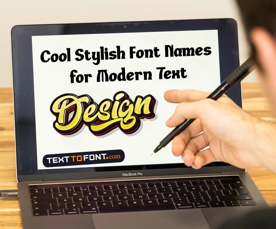
Cool Stylish Font Names for Modern Text Design Ideas
Cool and stylish fonts have become a huge part of today’s modern text design ideas. Individuals and brands are now focusing on using different types of texts to make their logos, graphics, and other digital designs both attractive and impactful.
There are dozens of different types of cool, stylish fonts available on the Text to Font generator tool that you can now utilize in your modern text design ideas. In this article, we will explore some of the top stylish font names that are perfect for creating eye-catching designs.
The Importance of Choosing the Right Font
Choosing the right font is essential in modern design because it affects how your audience perceives your message. These styles can convey personality, set the tone, and improve readability. They help establish brand identity through consistent use across logos, social media, and marketing materials.
The right text style can attract attention, make text more appealing, and communicate the intended mood, whether modern, elegant, or playful. It is important to match the font to the context and purpose to ensure your design is both stylish and effective.
Best Font Styles to Add in Your Modern Text Designs:
Modern text design relies on choosing fonts that match your project’s tone and purpose. Here are some of the best font styles to consider, along with their ideal uses:
1. Instrument Sans
Instrument Sans is a sleek, modern sans-serif font that combines minimalism with versatility. Its clean lines and geometric forms make it ideal for digital interfaces, branding projects, and web design.
Its contemporary look ensures your text remains legible while giving a professional and stylish feel.
Designers often use it for UI elements, app interfaces, and corporate communications because it balances readability with aesthetic appeal.
2. Work Sans
Work Sans is a highly readable sans-serif font designed for both print and digital screens. Its geometric letterforms give it a friendly, approachable feel without sacrificing professionalism.
This makes it perfect for headings, body text, websites, and blog content.
Work Sans is especially useful in responsive designs where clarity and scalability are important, ensuring text looks consistent across devices.
3. Instrument Serif
Instrument Serif blends elegance with modern typography. Its refined serifs and high contrast strokes create a sophisticated appearance.
This font is perfect for editorial designs, magazines, high-end branding, and print projects where a sense of refinement is desired. Using Instrument Serif adds a professional, upscale touch to your text, making it stand out without being overpowering.
4. Rethink Sans
Rethink Sans is a modern sans-serif font that emphasizes clarity and professionalism. Its simple, clean lines make it highly versatile, suitable for websites, logos, apps, and marketing materials.
Rethink Sans works well in projects where readability is crucial, but you still want a modern and stylish appearance. Its neutral yet distinctive look allows it to blend seamlessly with various design styles.
5. Quintessential
Quintessential is a high-contrast serif font with elegant curves and a luxurious feel. It is ideal for premium branding, editorial headlines, invitations, and packaging design.
The font’s refined details convey sophistication, making it a go-to choice for projects that require a touch of elegance.
Designers often pair it with clean sans-serif fonts to create contrast and visual hierarchy.
6. Plus Jakarta Sans
Plus Jakarta Sans is a versatile geometric sans-serif font designed for modern digital applications. Its balanced letterforms and clean lines make it suitable for corporate branding, websites, mobile apps, and social media posts.
The font’s structure ensures it remains readable in both large headings and smaller body text, making it highly adaptable for multiple design scenarios.
7. Inclusive Sans
Inclusive Sans is designed with accessibility and readability in mind. Its friendly and approachable shapes make it perfect for digital interfaces, presentations, and educational materials.
The font ensures clarity across different devices and screen sizes, while its modern aesthetic keeps designs feeling current. Inclusive Sans is particularly effective in projects that prioritize user experience without compromising on style.
8. Playfair Display
Playfair Display is a timeless serif font with high-contrast strokes and elegant curves. It works exceptionally well for editorial layouts, fashion branding, luxury websites, and headline text.
The font’s classic yet contemporary feel allows designers to add a touch of sophistication to their projects while maintaining readability. Playfair Display pairs beautifully with sans-serif fonts for balanced typographic design.
9. Montserrat
Montserrat is a geometric sans-serif font inspired by urban signage. Its clean and modern shapes give designs a contemporary and approachable feel. It is widely used for headings, social media graphics, websites, and branding materials.
Montserrat’s versatility allows it to work in both large display text and smaller body copy, making it a favorite choice for designers aiming for a modern yet timeless aesthetic.
10. Open Sans
Open Sans is a neutral and highly legible sans-serif font designed for maximum readability across digital and print formats. Its open letterforms make it suitable for websites, mobile apps, marketing materials, presentations, and professional documents.
The simplicity of this style ensures it pairs well with other typefaces while maintaining a clean, modern look that works in almost any design context.
Top Tips for Finding the Right Text Style:
We have explained some of the top styles that are suitable for your modern designs. However, not all of them are suitable for everyone. So, you should focus on these tips in order to find the right text style for yourself:
- Define your purpose first: Identify whether the text is for a logo, website, social media post, or print material. The purpose will guide your font choice.
- Consider readability: Ensure the font is easy to read at different sizes and across devices. Avoid overly decorative fonts for body text.
- Match the mood: Choose a font that reflects the tone of your project, whether it’s playful, elegant, modern, or professional.
- Limit font combinations: Stick to 2–3 fonts per design to maintain consistency and avoid clutter. Pair complementary fonts for headings and body text.
- Check versatility: Make sure the font works well in uppercase, lowercase, numbers, and symbols for all design needs.
- Test across platforms: Preview your font on websites, mobile screens, and print to ensure it maintains clarity and style.
- Keep trends in mind: Modern fonts often include geometric sans-serifs or sleek serifs; using current styles can make your design feel fresh.
- Consider brand identity: If you’re designing for a brand, ensure the font aligns with existing colors, logos, and messaging.
How to Pair Fonts Effectively
Pairing fonts correctly can make your design look professional and visually appealing. A classic approach is to combine a serif font for headings with a sans-serif font for body text.
This creates contrast and improves readability. You can also experiment with different weights or styles within the same font family to add hierarchy while maintaining harmony.
When using decorative or display fonts, pair them with a simple font to avoid clutter. Always test your combinations in context to ensure they look balanced and readable across different devices and sizes. Effective font pairing enhances both style and clarity in your design.
Stylizing Your Normal Text:
Using normal text fonts without adding stylized elements can be a little boring. It’s important that you play around and explore different creative tools that help bring personality into your design. A fancy text generator can add decorative flair to otherwise plain lettering. Using such a tool can make your text feel more engaging, expressive, and visually distinctive.
Similarly, if you’re working on something bold or edgy, a glitch text generator can introduce a modern, distorted effect that instantly grabs attention. Experimenting with these options allows you to transform simple text into something visually dynamic and memorable.
Keep in mind…
Here’s what you need to keep in mind when it comes to utilizing these fonts:
- Avoid using overly decorative fonts for body text.
- Limit the number of fonts per design to 2–3.
- Make sure fonts match the context and audience.
- Check readability on different devices and screen sizes.
- Ensure fonts align with your brand identity.
- Don’t sacrifice clarity for style.
Conclusion:
Modern text designs require using different types of font styles in order to attract readers and have a positive impact. Since there are dozens of different styles available out there, picking the right option is always a confusing thing to do.
Well, that confusion has now been solved.
The discussed styles above are some of the best picks that instantly improve the impact and attractiveness of your text design. You should explore these styles and utilize any font that suits your designs.
Frequently Asked Questions (FAQs):
Q: How many different fonts should I use in a single design or website?
Most experts recommend limiting yourself to two or three fonts per project to keep the design cohesive and avoid visual clutter.
Q: What makes a font easy to read across different devices and screen sizes?
Readability depends on clear letterforms, good contrast with the background, and appropriate line spacing; fonts with clean, simple shapes tend to remain legible even when scaled down.
Q: Should I mix serif and sans‑serif fonts, or stick to one typeface style only?
Mixing a serif font for headings with a sans‑serif for body copy (or vice versa) often creates a pleasing contrast, giving structure and visual hierarchy while maintaining readability.
Q: Are decorative or script fonts good for large blocks of text?
No, decorative and script fonts may look attractive, but they usually reduce readability when used for long passages; they’re better suited for headings, logos, or short accents.
Q: What should I check to ensure the font choice aligns with my brand or project’s tone?
You should consider the audience, purpose, and context. For example, a sleek modern font might suit a tech brand, while a classic serif could work better for a formal or traditional brand.

Admin
Admin is a professional and creative specializing in the latest stylish font styles for social media and brand promotion. With a passion for modern typography and digital trends, Admin helps users create eye-catching text that stands out online.